Cocoa Internals/Buttons
Buttons Map
Despite of being a very basic control, buttons are complicated topic on macOS.
| LCL Button | macOS Button / Style | Description |
|---|---|---|
| TButton | Push Button
NSRoundedBezelStyle |
Per macOS design guidelines, Push buttons should only have labels on them, and no Icons. This is exactly, how LCL TButton behaves.
The biggest issue is that macOS Push Buttons are of a fixed height. While LCL buttons can be any height. The approach similar to the Carbon implementation could be used - after a certain height the button changes its bezel. currently r56760 it's disabled |
| TToggleBox | Push Button
NSRoundedBezelStyle with NSButtonTypePushOnPushOff type |
In order for ToggleBox to look exactly as TPushButton the same style is used.
However, Cocoa button Type is different. (It's required for the button to be drawn differently when "pressed".) Prior to r62250 the bezel style was NSTexturedRoundedBezelStyle, with NSToggleButton for button type. It's possible to use the same settings on revisions after 62250. All you need to do is modify global variables value of CocoaInt unit CocoaToggleBezel (which should be desired bezel) and CocoaToggleType (which should be the desired Cocoa button type for the toggle button). It's recommended to override them in the "initialization" section, prior to any button handle being created. |
| TBitBtn | Image Button
NSRegularSquareBezelStyle |
TBitBtn is a button that could hold an image in it's body.
The closest (not deprecated) to such tasks is NSRegularSquareBezelStyle in macOS TBitBtn could also be used as a replacement for TButton. I.e. TBitBtn could be a "Default" button on a modal dialog. And there's no corresponding replacement for that in macOS |
| TSpeedButton | This is not an actual control button, it's LCL-drawn button.
todo: no themes API customdrawn controls used? The font used for caption of the button is NSFont.systemFontOfSize |
Radio Buttons
From stackoverflow
- NOTE: Use of NSMatrix is discouraged in apps that run in Mountain Lion 10.8 and later. If you need to create a radio button group in an app that runs in Mountain Lion 10.8 and later, create instances of NSButton that each specify a button type of NSRadioButton and specify the same action and the same superview for each button in the group.
If all buttons call the same action method and are in the same superview, Cocoa automatically selects the clicked button and deselects the previous button and -- no code is necessary to do that.
TrackBar
TTrackBar implementation is based on top of NSSlider class.
NSSlider doesn't have a defined property for vertical or horizontal. It draws itself depending on which size (height or width) is larger than the other. Determining the preferred size also uses the current TTrackBar dimension. Thus the frame rect might need to be updated to match the selected orientation.
Autosizing allows it to resize one of the dimensions. (For Horizontal oriented trackbar, the height cannot be changed, while width can.)
NSSlider doesn't support custom tick marks. Those are drawn by the TCocoaSlider class (refer to drawRect:) method.
Cocoa NSSlider is always floating-point. It does support min and max values, but those are always of double as well. LCL track bar is always INTEGER.
Default NSSlider keyboard navigation always switches the position by 1/20th (between Min and Max) values.
- The value can be adjusted by using AltIncrementValue. If it's set, the keyboard navigation would be the specified value.
- The value can be restricted to go only by tickMarks (which might give effective of Int only, but only for a limited set of options).
- It's odd that method altIncrementValue always returns zero, even right after the new value was set. (other "double" returning methods work as expected.)
Textured styles
There are number of styles for buttons named "Textured" (i.e. NSTexturedRoundedBezelStyle, NSTexturedSquareBezelStyle). These buttons a designed to be used in "Metal" aka "Textured" style windows, and Window Frames (borders/tool bars) Thus these styles should not be used.
To see the all styles of buttons available you can use the following example: https://github.com/skalogryz/lcltests/tree/master/cocoabuttonsmatrix
Customize Style
In order to change a style of a button, one should change the button bezel (in some cases type also needs to be changed). (i.e. the most common style change is to show the proper "HELP" button. Which has a specific style in Cocoa)
uses
  ...
  {$ifdef LCLCocoa}
  ,CocoaAll
  {$endif}

var
  btn : TButton; // the same approach will work for TToggleBox and TBitBtn

  if not btn.HandleAllocated then btn.HandleNeeded;
  NSbutton(btn.Handle).setButtonType(NSHelpButtonBezelStyle);
  NSbutton(btn.Handle).setBezelStyle(NSMomentaryLightButton);
Such approach is useful when changing button style on case-by-case basis. One should keep in mind, that if buttons handle is recreated, the same steps will need to be completed again.
Styles and Types deprecation
A number of bezel styles and button types have been deprecated in the macOS API (eg NSHelpButtonBezelStyle). In fact it's only the name of the constant that is deprecated. The constants have been actually renamed from NSxxxxxBezelStyle to NSBezelStylexxxxx (ie NSHelpButtonBezelStyle to NSBezelStyleHelpButton).
Sizing
Cocoa vs Carbon
Styles are for Cocoa and Carbon are a little bit different for buttons. For example "default" height of Push button is different between Cocoa and Carbon. Thus a UI designed for Carbon might not look good for Cocoa.
This is a problem of buttons only, other rectangular controls (textbox, listbox) doesn't experience such problem.
Control Sizes
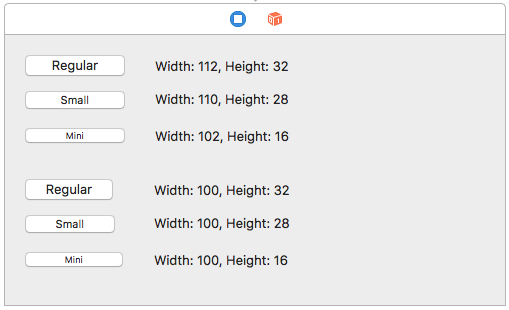
Most buttons in macOS design have a fixed height (i.e. Push Button). For such buttons macOS API provides the property "controlSize". Buttons are available in 3 variations: regular, small, mini. Each variant paints in its own manner:
Since Lazarus r56773, the widgetset auto detects one of the three variants from the button's Height.
Prior to that, only the "regular" size was used, causing visual artifacts, if the height of a button was smaller than expected by controlSize.
Also, the font of a button is forced to match the detected controlSize. (Todo: should do it, only if standard font is selected.)
Example of artifact, if button's Height is 21 (it must be 32). Note that top edge is clipped, and some blue area is painted.
Smart Style Selection
In macOS guidelines, the style that should be used for a button depends on the placement/usage of the button.
In the LCL design, there's no such thing as "style". It's presumed that the button would look the same, no matter where on the screen it's or what the button's parent. (It's not uncommon to design the interface in such a way).
Thus some LCL buttons might look foreign to macOS native applications, just because the wrong button styles are used. For example, a push button is used in a tool bar.
There are a few approaches what could be used:
- adding new TxxxButton classes into LCL (quite wasteful, and might not be applicable for other OSes)
- adding a style property to TBitBtn button (non Delphi compatible)
- changes styles within Cocoa widgetset, automatically, depending on the placement of the button.
Ampersand in Captions
LCL is working in Windows compatible mode, where a button can have a hot key assigned by marking a desired letter with an ampersand in front of it.
For example
- &Open
turns into
- Open
A user can hit Alt+O to press the button.
macOS no longer has the similar concept. (Those were known as mnemonics, but APIs for mnemonics are deprecated).
LCL assigns button captions with the ampersand in it, and those needs to be removed prior to assigning to the actual button. (see ControlTitleToStr in CocoaUtils.pas).
LCL also expects the "text" of the control to return the value WITH ampersand, for this reason GetText() for buttons returns FALSE. Indicating that LCL should use the cached "fCaption" value.
See Also
- Cocoa Internals
- https://developer.apple.com/macos/human-interface-guidelines/buttons/checkboxes/ - the official guide to macOS button styles
- https://developer.apple.com/documentation/appkit/nsbezelstyle?language=objc - bezel constants descriptions
- https://mackuba.eu/2014/10/06/a-guide-to-nsbutton-styles/ - a non-official guide to macOS button styles

