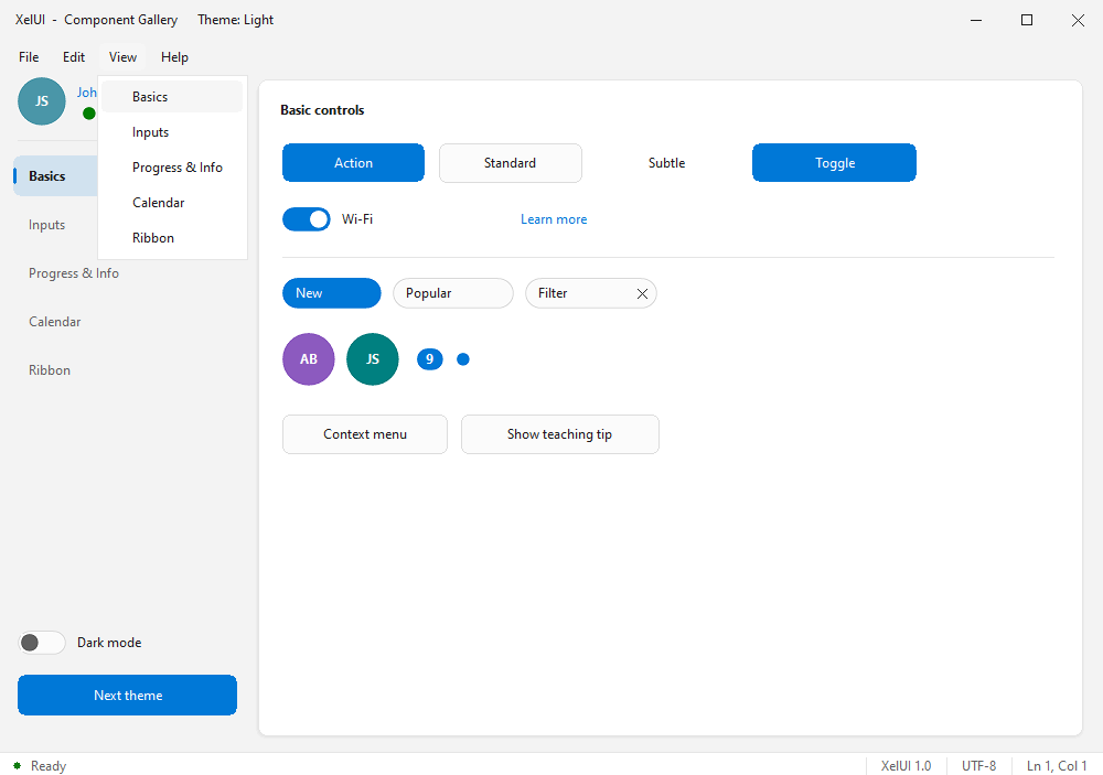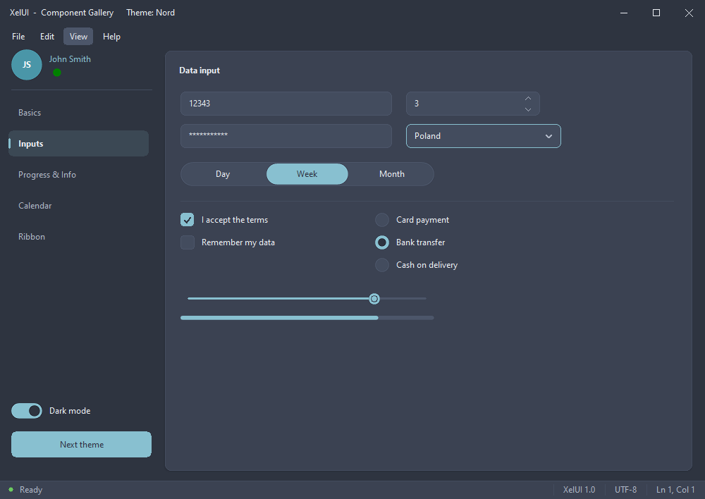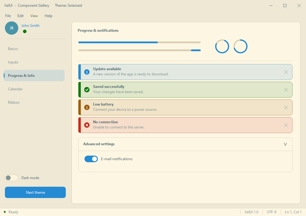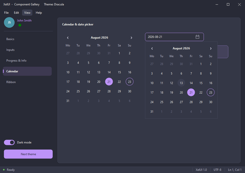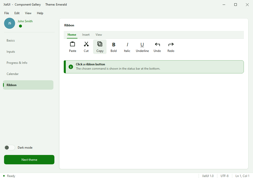

XelUI is a collection of modern UI controls for Lazarus, inspired by the design language and controls of WinUI 3. It provides a set of ready-to-use controls designed to give LCL applications a modern appearance while keeping the familiar Lazarus development experience. The installable package is available through the Online Package Manager (OPM).
Controls
editXelUI currently includes the following controls:
Basic controls
edit- Button
- Toggle Button
- Switch
- Check Box
- Radio Button
- Slider
- Hyperlink
- Text Box
- Number Box
- Combo Box
- Separator
Containers and layout
edit- Card
- Expander
- Navigation View
- Segmented
- Mini Ribbon
Progress and status
edit- Progress Bar
- Progress Ring
- Info Bar
- Status Bar
- Badge
Menus and interaction
edit- Menu Flyout
- Menu Bar
- Teaching Tip
- Chip
Date and calendar
edit- Date picker
- Calendar
User interface
edit- Avatar
Themes
editXelUI includes 12 built-in themes, with both light and dark variants.
The available themes are:
xskLightxskDarkxskMidnightxskNordxskSolarizedxskDraculaxskGruvboxxskSepiaxskHighContrastxskEmeraldxskRosexskOcean
Setting a theme
editTo change the current theme, include the XelUI.Theme unit and call XelTheme.SetSkin:
uses XelUI.Theme;
...
XelTheme.SetSkin(xskLight);
//Other possible values: xskDark, xskMidnight, xskNord, xskSolarized, xskDracula, xskGruvbox, xskSepia, xskHighContrast, xskEmerald, xskRose, xskOcean
The theme can be changed at runtime, allowing applications to provide light/dark mode or theme selection to their users.
Demo
editA demo application showcasing the available XelUI controls and themes is available. It provides examples of the controls in use and can be useful for exploring the visual styles and capabilities of the library.