Difference between revisions of "Adding an About dialog as a property to a custom component"
From Free Pascal wiki
Jump to navigationJump to search (Updated example code) |
Minesadorada (talk | contribs) m (Minor update) |
||
| Line 73: | Line 73: | ||
AAboutBox:TAboutBox; | AAboutBox:TAboutBox; | ||
begin | begin | ||
| − | |||
AAboutBox:=TAboutBox(GetObjectValue(TAboutBox)); | AAboutBox:=TAboutBox(GetObjectValue(TAboutBox)); | ||
AABoutBox.ShowDialog; | AABoutBox.ShowDialog; | ||
Revision as of 14:24, 11 June 2014
Summary
This article is for writers of Lazarus visual components (descended from TComponent or descendants)
- With the addition of a few lines of code to your component, it can display an 'About' property with an ellipsis button in the IDE Object Inspector
- When the programmer clicks the button, a customised modal 'About' dialog is displayed
- As well as an 'OK' button, the dialog can also display a 'License' button
- When clicked, this displays one of the standard licenses (GPL, LGPL etc) in a modal window
This is what it would look like:
Object Inspector example screenshot
About dialog example screenshot
- Clicking the ellipse button shows this:
License screen example screenshot
- Clicking the License button shows this:
Download example code
You can download the full source for an example component as described in this article here
Installation of example code
- Open customcomponent.lpk in the Lazarus IDE
- In the Package dialog:
- Click 'Compile'
- Click 'Use/Install'
- When Lazarus askes you whether you want to recompile the IDE, click 'Yes'
The package 'aboutdialog.lpk' should automatically install as DesignTime only
How to use example code
- Open a new Application project
- Drop a 'MyCustomComponent' from the 'Additional' component palette onto the form
- Highlight the component, and check the Object Inspector
- Click the 'About' property ellipsis [...]
Making this work in your own custom component
Adding aboutdialog as a requirement
- Make sure the subcomponent package 'aboutdialog' and its files are available in the same folder as your new component.
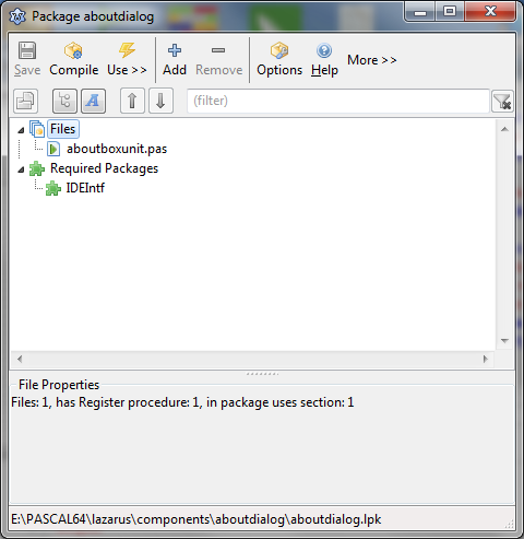
Opening the package 'aboutdialog' looks like this:
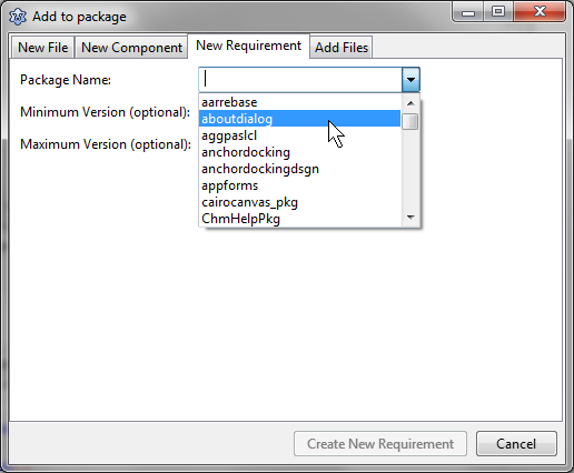
- In your custom component package, add 'aboutdialog' as a dependency. Like this:
- This will ensure that it will always compile with your component.
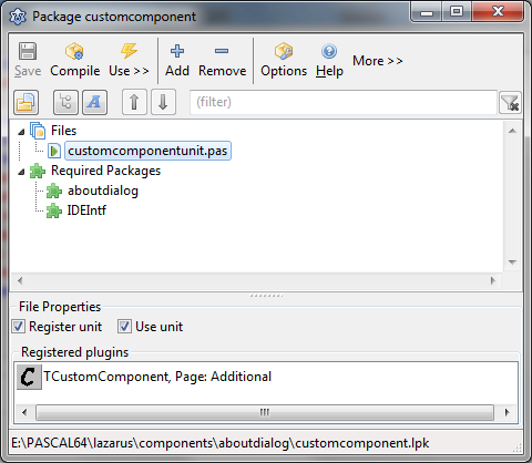
- Your component package will now look like this:
Adding the code 'by hand' to your custom component code
- This looks like a lot, but it only takes 5 minutes using copy/paste
- The easier route is to use the example component source as a template for your component
- Add to your Uses clause
ExtCtrls, AboutboxUnit, PropEdits;
- Add to the private section of your component class declaration
 TMyCustomComponent = class(TComponent)
 private
   { Private declarations }
   fAboutBox: tAboutBox;
- Add a published property
property About: tAboutBox read fAboutBox write fAboutBox;
- In the Type block (before the Register declaration) add:
 TAboutPropertyEditor = class(TClassPropertyEditor)
 public
   procedure Edit; override;
   function GetAttributes: TPropertyAttributes; override;
 end;
- In your Register procedure add (where 'TMyCustomComponent' is the name of your component)
 RegisterPropertyEditor(TypeInfo(TAboutbox),
   TMyCustomComponent, 'About', TAboutPropertyEditor);
- After the Register procedure add the following:
procedure TAboutPropertyEditor.Edit;
// Communicate with the component properties
Var
   AAboutBox:TAboutBox;
begin
   AAboutBox:=TAboutBox(GetObjectValue(TAboutBox));
   AABoutBox.ShowDialog;
end;
function TAboutPropertyEditor.GetAttributes: TPropertyAttributes;
 // Show the ellipsis
begin
  Result := [paDialog, paReadOnly];
end;
- In your Constructor procedure (Create) add this Var:
var
 TempImage: TPicture;
- In your Constructor Create() add this code.
- This is where you set the About properties to suit your Component
inherited Create(AOwner); // For your component
 fAboutBox := tAboutBox.Create(nil);
 with fAboutBox do
 begin
   SetSubComponent(True);  // Tell the IDE to store the modified properties
   // Set properties of your Component About Dialog here
   // All are optional
   ComponentName := 'My Custom Component';
   Title := 'About ' + ComponentName;
   Description.Add('This is a test case to demonstrate'); //TStrings
   Description.Add('the use of TAboutBox as a subcomponent'); //TStrings
   Width := 320; //Integer
   Height := 280; //Integer
   // Set any Font properties or subproperties here
   Font.Name := 'Arial';
   Font.Color := clNavy;
   // BackGroundColor shows if no BackGround image is set
   BackGroundColor := clSkyBlue;
   Version := '1.0.0.0';
   AuthorName := 'Gordon Bamber';
   AuthorEmail := 'minesadorada@charcodelvalle.com';
   Organisation := 'Public Domain';
   //Types available: abNone, abGPL, abLGPL, abMIT, abModifiedGPL, abProprietry
   LicenseType := abLGPL;
   // BackGround image is optional
   //== How to set a background image to your About dialog --
   // The BackGround property is a TBitmap
   // Use a Temporary TPicture to load a JPG  (NOT a PNG) etc.
   TempImage := TPicture.Create;
   // .lrs file containing 'brushedsteel' PNG is in the initialization section
   TempImage.LoadFromLazarusResource('brushedsteel');
   BackGround.Assign(TempImage.Bitmap);
   TempImage.Free;
   StretchBackground := True; //Boolean
 end;
- In your component Destructor procedure add:
 FreeAndNil(fAboutBox);
 inherited Destroy; // for your component
- To load a background image, add it as a resource here
- The resource name is referenced in the LoadFromLazarusResource call
initialization
{$I backgroundimage.lrs}
- Note all the above code is cut+paste from the example code in the download link
- Once all that 'About' property code is in place, then start adding your component code as normal..


