Eye-Candy Controls
Overview
About
Eye Candy Controls (a.k.a. ECControls) are set of visual controls written for Lazarus. Their design is based on Themes, therefore they look is very native everywhere, no matter what widgetset you use.
License
GNU Lesser General Public License 2.0 with linking exception (a.k.a. Modified LGPL). Each file of EC-Controls contains license header. Also, files COPYING.modifiedLGPL.txt and COPYING.LGPL.txt are bundled to each archive.
Author
All components are written by Blaazen. Copyright notice and real name are mentioned in header of each file of EC-Controls. You can contact author on Lazarus Forum (nickname: Blaazen) in any thread about EC-Controls. If you are logged to forum, you can get e-mail of author or send private message.
Install
Download EC-Controls
SourceForge: https://sourceforge.net/projects/eccontrols/
UltraShare: http://ultrashare.net/hosting/fl/4a5dee7961 (direct link to 0.9.2.12 released 29-th July 2015)
UltraShare is alternative because SourceForge is blocked in some countries. If you need link to the latest release, search in section Third Party on Lazarus Forum.
Install EC-Controls
Open menu Package/Open package File (*.lpk) ... and select file eccontrols.lpk. Click Compile and then Use >> Install. Lazarus will ask you "Do you want to rebuild Lazarus now?". "Yes" will install the package.
Components
EC-Controls are installed to the tab EC-C on the Lazarus component palette.
Components below are listed in order of their appearance on the component palette. All screenshots are taken from KDE4 (Lazarus+Qt).
Visual
TECBevel
TECLink
TECImageMenu
Vertical menu with images. Similar component is frequently used in KDE4 applications.
TECImageMenu makes properties published only.
TECImageMenu can have focus and can be reached by Tab key (when TabStop = True, which is default).
TECImageMenu can be controlled by mouse, by keyboard or by code.
Mouse
Simply left-click on menu item.
Middle-click or right-click selects an item but does not click.
Mouse wheel moves the selection but does not click.
Keyboard
Space nad Enter: click on the selected item.
Arrow Up, Arrow Down, Page Up, Page Down, Home and End: moves the selection but does not click.
Acceleration key (Alt + Key) selects and clicks the relevant item (menu doesn't need to be focused)..
TECSpinBtns
Advanced alternative to TUpDown.
TECSpinBtns cannot have focus.
TECSpinBtns is based on double precision variables.
TECSpinBtns can be controlled by mouse or by code.
Mouse
TECSpinBtns consists from 9 small buttons. Left-click on BtnMin, BtnBigDec, BtnDec, BtnMiddle, BtnMenu, BtnInc, BtnBigInc and BtnMax sets the Value to Min, decreases Value by PageSize, decreases Value by Increment, sets Value to Middle, triggers OnMenuClick event, increases Value by Increment, increases Value by PageSize and sets Value to Max respectively.
Middle-click sets Value to Middle or triggers OnMenuClick - depends on MenuControl property. Other mouse buttons can be used for dragging too, depends on DragControl property. Dragging mainly depends on properties: DragOrientation, MouseIncrementX, MouseIncrementY, MouseStepPixelsX, MouseStepPixelsY and Reversed.
Code
Simply by assigning any floating-point value to property Value:
Value := 10.5;
If the value is out of range (lesser than Min or greater than Max) then Value will be Min or Max.
Precendence of drawing:
1) The highest precedence has the OnDrawGlyph event.
2) The second is Caption. It should be short (one or two characters). 3) The third is image from Images. Images must be assigned and ImageIndex must be greater or equal to zero and lesser than Images.Count 4) When the OnDrawGlyph is not assigned, Caption is empty string and ImageIndex is -1 then built-in glyph is used. There is five sets of styles, they can be selected with GlyphStyle property.
TECSpinEdit
An alternative to TSpinEdit and TFloatSpinEdit.
TECSpinEdit can have focus and can be reached by Tab key (when TabStop = True, which is default).
TECSpinEdit can be controlled by mouse, by keyboard or by code.
Mouse
See TECSpinBtns.
Keyboard
(lineedit must be focused):
Text value can typed in to the line-edit directly. If entered value is lesser than TECSpinBtnsPlus.MinInEdit or greater than TECSpinBtnsPlus.MaxInEdit then the value will be changed to fit these bounds. Change is done OnEditingDone.
Arrow Up/Down do click on BtnInc/BtnDec*.
PgUp/PgDn do click on BtnBigInc/BtnBigDec*.
Ctrl + Home/End do click on BtnMax/BtnMin*.
Ctrl + Space do click BtnMiddle.
Ctrl + Enter do click on BtnMenu.
*) valid for Reversed = False. For Reversed = True works oppositely.
Code
Simply by assigning any floating-point value to property Value:
Value := 10.5;
If the value is out of range (lesser than Min or greater than Max) then Value will be Min or Max.
TECSwitch
An alternative to TCheckBox. Similar component exists in GTk3.
TECSwitch can have focus and can be reached by Tab key (when TabStop = True, which is default). TECSwitch can be controlled by mouse, by keyboard or by code.
Mouse
Left-click on switch area (out of knob) will change the State*.
Left-click on the knob and holding the left-mouse button down will capture mouse and knob can be moved even if the mouse-cursor leaves the area of the switch.
Keyboard
Space or Enter changes the State* (only when focused).
Acceleration key (Alt + Key) changes the State* (doesn't need to be focused).
Code
Simply by assigning any State* or Checked property:
Checked := True; //False
State := cbChecked; //cbGrayed, cbUnchecked
*) Property State is always changed from checked to unchecked, from grayed to unchecked or from unchecked to checked.
TECSpeedBtn
Button with some advanced features and built-in glyphs. An alternative to TSpeedButton and TToggleBox.
TECSpeedBtn cannot have focus.
Features and differences from TSpeedButton:
- TSpeedButton has property Glyph: TBitmap. TECSpeedBtn has properties ImageIndex: Integer and Images: TImageList instead.
- TECSpeedBtn has property Delay and built-in timer. Therefore it can work as a delay-button (Delay>0) or toggle-box (Delay<0).
- TECSpeedBtn has more than 80 built-in glyph (painted via TCanvas helper). Glyphs can be various for checked and unchecked state.
- Similarly to TSpeedButton, TECSpeedBtn has properties GroupIndex, Checked and AllowAllUp so buttons can be grouped to radio-group.
- TECSpeedBtn cannot obtain focus but can be pressed by acceleration key (Alt+ [underlined key]).
- TECSpeedBtn can be linked with TAction too.
Precendence of drawing:
1) The highest precedence has the OnDrawGlyph event.
2) The second is Caption and image from Images. Images must be assigned and at least on of ImageIndex and ImageIndexChecked must be greater or equal to zero and lesser than Images.Count.
3) When the OnDrawGlyph is not assigned and both ImageIndex and ImageIndexChecked are -1 then built-in glyph is used (properties GlyphDesign and GlyphDesignChecked). When ImageIndex is valid Image and ImageIndexChecked is -1 or only GlyphDesign is some glyph and GlyphDesignChecked then ImageIndex or GlyphDesign is used for checked state too (and vice versa).
TECEditBtn
An alternative to TEditButton.
TECColorBtn
Visual component for selecting color. Line edit displays color code in various formats and associated button triggers color dialog.
Color of the glyph on the button corresponds with the color in the line-edit.
Property Text is not published. If Text is changed via code EditingDone must be called to validate the change.
TECComboBtn
A combobox with associated button.
TECColorCombo
Visual component for selecting color. Combobox contains colors in various formats and associated button triggers color dialog.
Color of the glyph on the button corresponds with the color selected in the combobox.
Property Text is not published. If Text is changed via code Validate must be called to validate the change.
TECHeader
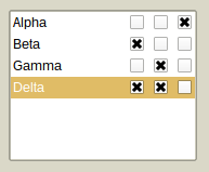
TECCheckListBox
TECSlider
An advanced alternative to TTrackBar.
TECSlider can have focus and can be reached by Tab key (when TabStop = True, which is default).
TECSlider is based on double precision variables. TECSlider can be controlled by mouse, by keyboard or by code.
Mouse
Left-click on Slider area (out of Knob) will move the knob by PageSize (or less, if mouse cursor is nearer).
Double-click or Middle-click will move the knob immediately to the mouse cursor (or to the Min/Max, if click is done out of groove and scale area).
Left-click on the knob and holding the left-mouse button down will capture mouse and knob can be moved even if the mouse-cursor leaves the area of the slider.
Mouse wheel moves knob up/down regardless of the Reversed property. In case of horizontal slider rolling up/down moves knob to the left/right, again, regardless of the Reversed property.
The increment is:
Mouse wheel: Increment*Mouse.WheelScrollLines
Ctrl + mouse wheel: Increment.
Keyboard
Space: moves knob to the middle of the groove or to the ProgressMiddlePos in case of ProgressFromMiddle = True
0-9: moves the knob to position which is the integer multiplier of the PageSize (i.e. 0, 10, ..., 90 for PageSize = 10).
PgUp: decreases Position by PageSize
PgUp: increases Position by PageSize
Home: moves the Knob to Min
End: moves the Knob to Max
+: increases Position by Increment
-: decreases Position by Increment
Ctrl + ArrowUp: decreases* Position by Increment
Ctrl + ArrowLeft: decreases* Position by Increment
Ctrl + ArrowDown: increases* Position by Increment
Ctrl + ArrowRight: increases* Position by Increment
*) valid for Reversed = False. When Reversed = True works oppositely.
Code
Simply by assigning any floating-point value to property Position:
Position := 10.5;
If the value is out of range (lesser than Min or greater than Max) then Position will be Min or Max.
TECProgressBar
An advanced alternative to TProgressBar.
TECProgressBar is based on double precision variables. TECProgressBar cannot have focus. It can be controlled by code only.
TECPositionBar
An alternative to TTrackBar or TScrollBar. Similar components are used in Blender (3D graphics software).
TECPositionBar cannot have focus.
TECPositionBar is based on double precision variables.
TECPositionBar can be controlled by mouse or by code.
Mouse
Left-click will set the position immediately to the mouse cursor (or to the Min/Max, if click is done out of groove and scale area).
Middle-click: moves knob to the middle of the groove or to the ProgressMiddlePos in case of ProgressFromMiddle = True
Left-click on the end of the progress on and holding the left-mouse button down will capture mouse and position can be moved even if the mouse cursor leaves the area of a position bar.
Dragging is affected by MouseDragPixels (alone left mouse button) and MouseDragPixelsFine (Ctrl + left mouse button). Deafult values are 1 and 10, i.e. progress will change by one pixel when mouse cursor moves by one pixel (or by 10 pixels in case of dragging with Ctrl key pressed).
Mouse wheel moves knob up/down regardless of the Reversed property. In case of horizontal slider rolling up/down moves knob to the left/right, again, regardless of the Reversed property.
The increment is:
- Mouse wheel: MouseDragPixels*Mouse.WheelScrollLines
- Ctrl + mouse wheel: (MouseDragPixels/MouseDragPixelsFine)*Mouse.WheelScrollLines
Code
Simply by assigning any floating-point value to property Position:
Position := 10.5;
If the value is out of range (lesser than Min or greater than Max) then Position will be Min or Max.
TECSpinPosition
TECRuler
An advanced ruler.
TECRuler cannot have focus.
TECRuler just displays scale. It can have fixed or movable pointer optionally.
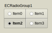
TECRadioGroup
An alternative to TRadioGroup.
TECRadioGroup can have focus and can be reached by Tab key (when TabStop = True, which is not default).
TECRadioGroup can be controlled by mouse, by keyboard or by code.
Mouse
Left-click on any item (out of knob) changes its Checked property to True (or to False if this item is already checked*).
Left-click on the TECRadioGroup out of items sets focus to component only.
Keyboard
0: deselects all*
1-9: selects (or deselects*) item 1-9
Acceleration key (Alt + Key) changes the Checked property to True or False* (radio group doesn't have to be focused).
*) Depends whether egoAllowAllUp is in Options.
Code
Simply by assigning any ItemIndex or Items[].Checked property:
ItemIndex := 1; //selects the second item
Items[1].Checked := False; //deselects the second item, regardless of the egoAllowAllUp in Options
TECCheckGroup
An alternative to TCheckGroup.
TECCheckGroup can have focus and can be reached by Tab key (when TabStop = True, which is not default).
TECCheckGroup can be controlled by mouse, by keyboard or by code.
Mouse
Left-click on any item (out of knob) changes its Checked property to True (or to False if this item is already checked*).
Left-click on the TECCheckGroup out of items sets focus to component only.
Keyboard
0: deselects all*
1-9: selects (or deselects*) item 1-9
Acceleration key (Alt + Key) changes the Checked property to True/False* (check group doesn't have to be focused).
*) Depends whether egoAllowAllUp is in Options.
Code
Simply by assigning any Checked[] or Items[].Checked property:
Checked[1] := True; //selects the second item
Items[1].Checked := False; //deselects the second item, regardless of the egoAllowAllUp in Options.
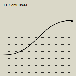
TECConfCurve
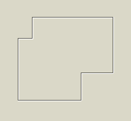
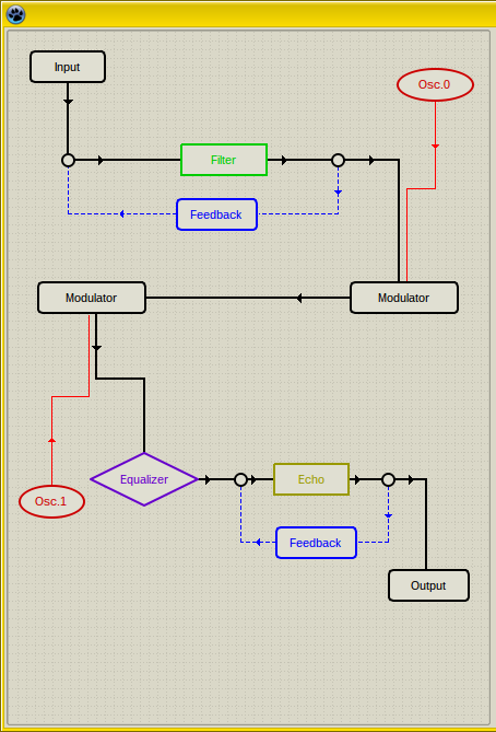
TECScheme
Non-visual components
TECSpinController
Designed for controlling properties of multiple TECSpinBtns and TECSpinEdit.
TECSpinBtns and TECSpinEdit have properties Controller. When some SpinController is assigned to this property then this Controller can change some properties of all assigned TECSpinEdits and TECSpinBtns at a time. Adjustable properties are - for example - TimerDelay, TimerRepeat, widths of individual buttons, GlyphsStyle and others.
Project can have multiple SpinControllers.
TECTimer
An advanced timer.
Main feature is that the first interval (property Delay) can differ from all following intervals (property Repeat).

