TAChart Tutorial: Getting started
Getting Started with TAChart
If you want to add a diagram to your Lazarus form you should have a look at TAChart. This is Lazarus' diagram package.
In this tutorial we will draw some elemental mathematical functions by TAChart. We will create a chart with three line series for the functions y=cos(x), y=sin(x) and y=cos(x)*sin(x). Maybe it is necessary to expain the words "series" and "chart" here: the entire diagram is the "chart", and each of the functions will be displayed as a curve called "series". We will connect the data points by line sections, therefore, we will use the "line series". TAChart, of course, allows to use many other types of series, for example bar series, area series, pie series, or even advanced types like spline or fit series.
What is needed?
This guide will be very elemental. Of course, you'll need basic knowledge of the Object Pascal language and the Lazarus IDE. Use a not-too-old version of Lazarus since TAChart is actively developed and some features may change from version to version.
A new project
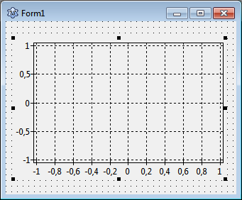
To begin with, we create a new project in Lazarus and, in the component palette we select the page "Chart". Click on the left-most icon, the TChart component, and add it to the form. You will see an empty diagram with standardized x and y axes.
Adding series
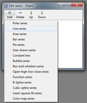
Now let's add series. For this purpose, double-click on the chart (or right-click, and select "Edit series" from the context menu). The TAChart series editor appears. It is still empty, but when you select "Add" you will see a menu with all the series types available within the TAChart package. Select the "line series". Repeat two times to create, in total, three line series that are assigned to the chart. They are not yet displayed in the chart, because they do not yet have any data. No data - no display. We will fix that in a minute.
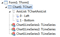
Before we do that let us have a look at the object inspector tree. TAChart uses a quite complex architecture of classes and containers, so it is important to understand the object tree. In the current state of our project we see the TChart component and its children, the three line series and the AxisList with Left and Bottom axes as children again. The series names are constructed according to Chart<number><SeriesType><Number>.
Why don't we give them more descriptive names, like SinSeries, CosSeries, and SinCosSeries? For this purpose, click on each series, and change the series Name in the corresponding field of the object inspector below.
Data
Now it's time to add data. The easiest option is to create the data along with the form, i.e. we write an event handler for OnCreate. Of course, in a "real" project, you will add data at other events, for example after a button click which initiates a calculations or reads data from a file.
procedure Form1Create(Sender: TObject);
const
  N = 100;
  MIN = -10;
  MAX = 10;
var
  i: Integer;
  x: Double;
begin
  for i:=0 to N-1 do begin
    x := MIN + (MAX - MIN) * i /(N - 1);
    SinSeries.AddXY(x, sin(x));
    CosSeries.AddXY(x, cos(x));
    SinCosSeries.AddXY(x, sin(x)*cos(x));
  end;
end;
This procedure creates 100 data points for each series. The x values are calculated to be equidistant between MIN and MAX, i.e. -10 and 10. The important lines are the calls to the AddXY method of each series. This method takes the x and y coordinates of each data point and adds them to an internal list. There are also overloaded versions of this method where you can also pass a label for each data point, as well as an individual color, but we don't need this feature here.
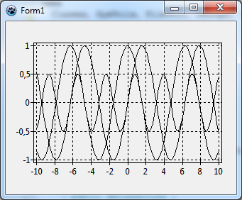
Ok, let's compile the program. We see the three curves, and the x axis automatically covers our data range between -10 and 10. Well - not too bad! But far from being perfect. The diagram is very confusing, we cannot discern the individual lines, and we cannot tell which series belongs to which function.


