Difference between revisions of "BGRAControls"
m (→TBGRALabelFX: removed finished ToDo and a function that really doesn't works.) |
(→TDTAnalogGaugue: typo) |
||
| (76 intermediate revisions by 14 users not shown) | |||
| Line 1: | Line 1: | ||
{{BGRAControls}} | {{BGRAControls}} | ||
| − | |||
| − | + | [[File:bgracontrols.png]] | |
| − | + | == Install == | |
| − | + | Use the [[Online Package Manager]] to get BGRABitmap and BGRAControls. | |
| − | + | Notice that you must check only the packages "bgrabitmappack.lpk" and "bgracontrols.lpk" in the Online Package Manager. The other packages are optional and may need third party packages / libraries to work (OpenGL and PascalScript). | |
| − | + | === Optional Components === | |
| − | + | Since v4.4 the components TBCDefaultThemeManager, TBCKeyboard and TBCNumericKeyboard are not installed by default to allow Linux users to get a seamless installation with the Online Package Manager not installing third party stuff. If you want these components turn on the "Register unit" in the package options for each file (bcdefaulthememanager.pas, bckeyboard.pas, bcnumerickeyboard.pas) then compile and rebuild Lazarus. On Linux you need to install libxtst-dev and libgl-dev first. | |
| − | + | === Website === | |
| − | + | BGRABitmap Organization on GitHub: https://github.com/bgrabitmap/ | |
| − | == | + | == BGRA Controls == |
| + | |||
| + | BGRA Controls is a set of graphical UI elements that you can use with Lazarus LCL applications. | ||
| + | Under Linux you need to have installed libxtst-dev and libgl-dev. | ||
| + | |||
| + | === TBCButton === | ||
| + | |||
| + | [[Image:bcbutton.png]] | ||
| + | |||
| + | A button control that can be styled through properties for each state like StateClicked, StateHover, StateNormal with settings like gradients, border and text with shadows. You can assign an already made style through the property AssignStyle. | ||
| + | |||
| + | === TBCButtonFocus === | ||
| + | |||
| + | Like TBCButton but it supports focus like normal TButton. | ||
| + | |||
| + | === TBCGameGrid === | ||
| + | |||
| + | [[Image:bcgamegrid.png]] | ||
| + | |||
| + | A grid with custom width and height of items and any number of horizontal and vertical cells that can be drawn with BGRABitmap directly with the OnRenderControl event. | ||
| + | |||
| + | === TBCImageButton === | ||
| + | |||
| + | [[Image:samplebgraimagebutton.png]] | ||
| + | |||
| + | [[Image:samplebgraimagebuttonalpha.png]] | ||
| + | |||
| + | A button control that can be styled with one image file, containing the drawing for each state Normal, Hovered, Active and Disabled. It supports 9-slice scaling feature. It supports a nice fading animation that can be turned on. | ||
| + | |||
| + | === TBCXButton === | ||
| + | |||
| + | [[Image:bcxbutton.png]] | ||
| + | |||
| + | A button control that can be styled by code with the OnRenderControl event. Or even better create your own child control inheriting from this class. | ||
| + | |||
| + | === TBCLabel === | ||
| + | |||
| + | [[Image:bclabel.png]] | ||
| + | |||
| + | A label control that can be styled through properties, it supports shadow, custom borders and background. | ||
| + | |||
| + | === TBCMaterialDesignButton === | ||
| + | |||
| + | A button control that has an animation effect according to Google Material Design guidelines. It supports custom color for background and for the circle animation, also you can customize the shadow. | ||
| + | |||
| + | === TBCPanel === | ||
| + | |||
| + | [[Image:bcpanel.png]] | ||
| − | + | A panel control that can be styled through properties. You can assign an already made style through the property AssignStyle. | |
| − | + | === TBCRadialProgressBar === | |
| − | + | A progress bar with radial style. You can set the color and text properties as you like. | |
| − | + | === TBCToolBar === | |
| − | + | A TToolBar with an event OnRedraw to paint it using BGRABitmap. It supports also the default OnPaintButton to customize the buttons drawing. By default it comes with a Windows 7 like explorer toolbar style. | |
| − | + | === TBCTrackBarUpdown === | |
| − | + | A control to input numeric values with works like a trackbar and a spinedit both in one control. | |
| − | + | === TBGRAFlashProgressBar === | |
| − | |||
| − | + | [[Image:BC-Bgraflashprogressbar.png]] | |
| − | + | A progress bar with a default style inspired in the old Flash Player Setup for Windows progress dialog. You can change the color property to have different styles and also you can use the event OnRedraw to paint custom styles on it like text or override the entire default drawing. | |
| − | == | + | === TBGRAGraphicControl === |
| − | + | Is like a paintbox. You can draw with transparency with this control using the OnRedraw event. | |
| − | == TBGRAImageList == | + | === TBGRAImageList === |
| − | + | An image list that supports alpha in all supported platforms. | |
| + | |||
| + | How app looks with TImageList (with transparent icons): | ||
[[Image:before-TImageList.png]] | [[Image:before-TImageList.png]] | ||
| − | + | How app looks with BGRAImageList: | |
[[Image:after-TBGRAImageList.png]] | [[Image:after-TBGRAImageList.png]] | ||
| − | + | === TBGRASVGImageList === | |
| − | == TBGRASpeedButton == | + | It is located in the BGRA Themes tab. |
| + | |||
| + | [[Image:bgrasvgimagelist_edit.png|450px]] | ||
| + | |||
| + | In its properties, one can define the size and a target raster image list (TImageList or TBGRAImageList): | ||
| + | |||
| + | [[Image:bgrasvgimagelist_prop.png|350px]] | ||
| + | |||
| + | This will automatically populate the target image list (here on MacOS, it provides the double sized icons for Retina): | ||
| + | |||
| + | [[Image:targetimagelist_edit.png|350px]] | ||
| + | |||
| + | === TBGRAImageManipulation === | ||
| + | |||
| + | [[Image:bgraimagemanipulation.jpg]] | ||
| + | |||
| + | A tool to manipulate pictures, see the demo that shows all the capability that comes with it. | ||
| + | |||
| + | === TBGRAKnob === | ||
| + | |||
| + | [[Image:BC-Bgraknob.png]] | ||
| + | |||
| + | A knob that can be styled through properties. | ||
| + | |||
| + | === TBGRAResizeSpeedButton === | ||
| + | |||
| + | A speed button that can resize the glyph to fit in the entire control. | ||
| + | |||
| + | === TBGRAShape === | ||
| + | |||
| + | [[Image:samplebgrashape.png]] | ||
| + | |||
| + | A control with configurable shapes like polygon and ellipse that can be filled with gradients and can have custom borders and many other visual settings. | ||
| + | |||
| + | === TBGRASpeedButton === | ||
[[Image:BGRASpeedButton.png]] | [[Image:BGRASpeedButton.png]] | ||
| − | + | A speed button that in GTK and GTK2 provides BGRABitmap powered transparency to the glyph. | |
| + | |||
| + | === TBGRASpriteAnimation === | ||
| + | |||
| + | [[Image:bgraspriteanimation.png]] | ||
| + | |||
| + | A component that can be used as image viewer or animation viewer, supports the loading of gif files. | ||
| + | |||
| + | === TBGRAVirtualScreen === | ||
| − | + | Is like a panel. You can draw this control using the OnRedraw event. | |
| − | + | === TDTAnalogClock === | |
| − | + | A clock. | |
| − | + | === TDTAnalogGauge === | |
| − | |||
| − | |||
| − | |||
| − | |||
| − | |||
| − | |||
| − | |||
| − | |||
| − | |||
| − | |||
| − | + | A gauge. | |
| − | + | === TDTThemedClock === | |
| − | + | Another clock. | |
| − | |||
| − | + | === TDTThemedGauge === | |
| − | + | Another gauge. | |
| − | + | === TPSImport_BGRAPascalScript === | |
| − | + | A component to load BGRABitmap pascal script utilities. | |
| − | == | + | == BGRA Custom Drawn == |
| − | + | BGRA Custom Drawn is a set of controls inherited from Custom Drawn. These come with a default dark style that is like Photoshop. | |
| − | + | === TBCDButton === | |
| − | + | A button control that is styled with TBGRADrawer. | |
| − | + | === TBCDEdit === | |
| − | + | An edit control that is styled with TBGRADrawer. | |
| − | + | === TBCDStaticText === | |
| − | + | A label control that is styled with TBGRADrawer. | |
| − | == | + | === TBCDProgressBar === |
| − | + | A progress bar control that is styled with TBGRADrawer. | |
| − | + | === TBCDSpinEdit === | |
| − | + | A spin edit control that is styled with TBGRADrawer. | |
| − | + | === TBCDCheckBox === | |
| − | + | A check box control that is styled with TBGRADrawer. | |
| − | + | === TBCRadioButton === | |
| − | + | A radio button that is styled with TBGRADrawer. | |
| − | == | + | == Sample code == |
| − | + | BGRA Controls comes with nice demos to show how to use the stuff and extra things you can use in your own projects. | |
| − | + | === Pascal Script Library === | |
| − | + | Putting BGRABitmap methods into a .dll with c#, java and pascal headers. | |
| − | == | + | === BGRA Ribbon Custom === |
| − | + | How to create a fully themed window using the controls to achieve a Ribbon like application. | |
| − | + | === Tests === | |
| − | + | There are test for analog controls (clock and gauge), BC prefixed controls, BGRA prefixed controls, BGRA Custom Drawn controls, how to use Pascal Script and BGRABitmap, bgrascript or how to create your own scripting solution with BGRABitmap. | |
| − | == | + | === Tests Extra === |
| − | + | [[Image:game_maze.png]] | |
| − | + | [[Image:game_puzzle.png]] | |
| − | + | [[Image:customdrawnwindows7.png]] | |
| − | [[ | + | [[File:slicescaledtachart.png]] |
| − | + | These are extra tests like how to use fading effect, an fpGUI theme, games like maze and puzzle, how we created the material design animation, pix2svg or how to convert a small picture to svg using hexagons, rectangles and ellipses, plugins or how to load .dlls and use into a TBGRAVirtualScreen, rain effect, shadow effect, 9-slice-scaling with Custom Drawn or how to theme with bitmaps an application to look like Windows themes and 9-slice-scaling with charts. | |
| − | + | == Other units == | |
| − | + | These units come with BGRA Controls and contains more functionality that is sometimes used with the controls, sometimes not but are usefull in some way. Some are listed here, others you can see linked directly with any control like bcrtti, bcstylesform, bctools and bctypes. | |
| − | + | === BCEffect === | |
| − | + | Fading effect with BGRABitmap. | |
| − | + | === BCFilters === | |
| − | + | A set of pixel filters to use with BGRABitmap. | |
| − | |||
| − | |||
| − | == | + | === BGRAScript === |
| − | + | Scripting with BGRABitmap, see test project. | |
| − | + | == Related Articles == | |
| − | |||
| − | |||
| − | |||
| − | |||
| − | + | [[BGRASpriteAnimation]] - Usage of the sprite animation component. | |
| − | [[ | + | [[uE_Controls]] - Other controls developed with BGRABitmap. |
| − | + | [[BGRABitmap]] - The library used to create this controls. | |
| − | |||
| − | |||
| − | + | [[LazPaint]] - A paint program developed with Lazarus and BGRABitmap. | |
| − | |||
| − | |||
[[Category:Components]] | [[Category:Components]] | ||
| + | [[Category:Graphics]] | ||
| + | [[Category:BGRAControls]] | ||
Latest revision as of 21:27, 13 August 2023
│
Deutsch (de) │
English (en) │
português (pt) │
русский (ru) │
中文(中国大陆) (zh_CN) │
Install
Use the Online Package Manager to get BGRABitmap and BGRAControls.
Notice that you must check only the packages "bgrabitmappack.lpk" and "bgracontrols.lpk" in the Online Package Manager. The other packages are optional and may need third party packages / libraries to work (OpenGL and PascalScript).
Optional Components
Since v4.4 the components TBCDefaultThemeManager, TBCKeyboard and TBCNumericKeyboard are not installed by default to allow Linux users to get a seamless installation with the Online Package Manager not installing third party stuff. If you want these components turn on the "Register unit" in the package options for each file (bcdefaulthememanager.pas, bckeyboard.pas, bcnumerickeyboard.pas) then compile and rebuild Lazarus. On Linux you need to install libxtst-dev and libgl-dev first.
Website
BGRABitmap Organization on GitHub: https://github.com/bgrabitmap/
BGRA Controls
BGRA Controls is a set of graphical UI elements that you can use with Lazarus LCL applications. Under Linux you need to have installed libxtst-dev and libgl-dev.
TBCButton
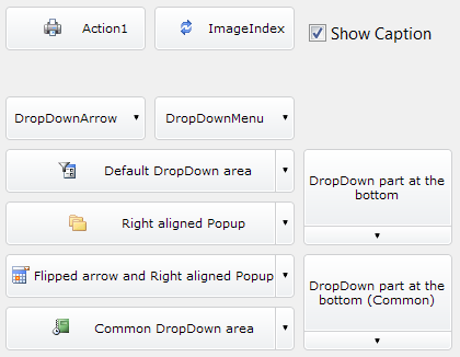
A button control that can be styled through properties for each state like StateClicked, StateHover, StateNormal with settings like gradients, border and text with shadows. You can assign an already made style through the property AssignStyle.
TBCButtonFocus
Like TBCButton but it supports focus like normal TButton.
TBCGameGrid
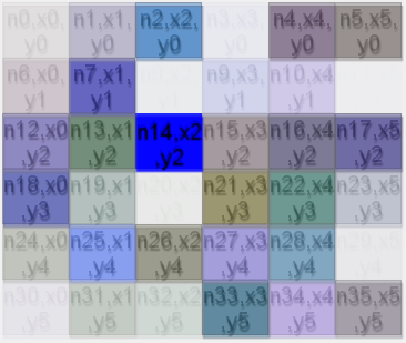
A grid with custom width and height of items and any number of horizontal and vertical cells that can be drawn with BGRABitmap directly with the OnRenderControl event.
TBCImageButton
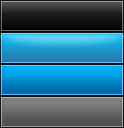
A button control that can be styled with one image file, containing the drawing for each state Normal, Hovered, Active and Disabled. It supports 9-slice scaling feature. It supports a nice fading animation that can be turned on.
TBCXButton
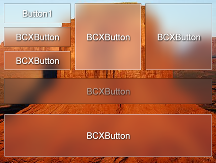
A button control that can be styled by code with the OnRenderControl event. Or even better create your own child control inheriting from this class.
TBCLabel
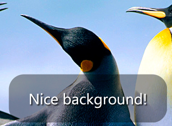
A label control that can be styled through properties, it supports shadow, custom borders and background.
TBCMaterialDesignButton
A button control that has an animation effect according to Google Material Design guidelines. It supports custom color for background and for the circle animation, also you can customize the shadow.
TBCPanel
A panel control that can be styled through properties. You can assign an already made style through the property AssignStyle.
TBCRadialProgressBar
A progress bar with radial style. You can set the color and text properties as you like.
TBCToolBar
A TToolBar with an event OnRedraw to paint it using BGRABitmap. It supports also the default OnPaintButton to customize the buttons drawing. By default it comes with a Windows 7 like explorer toolbar style.
TBCTrackBarUpdown
A control to input numeric values with works like a trackbar and a spinedit both in one control.
TBGRAFlashProgressBar
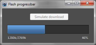
A progress bar with a default style inspired in the old Flash Player Setup for Windows progress dialog. You can change the color property to have different styles and also you can use the event OnRedraw to paint custom styles on it like text or override the entire default drawing.
TBGRAGraphicControl
Is like a paintbox. You can draw with transparency with this control using the OnRedraw event.
TBGRAImageList
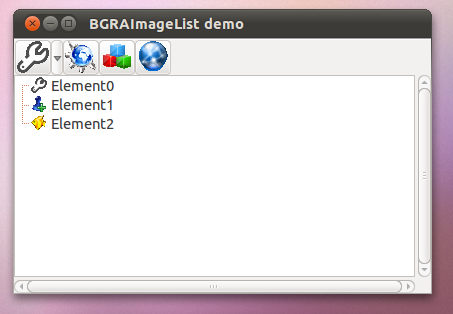
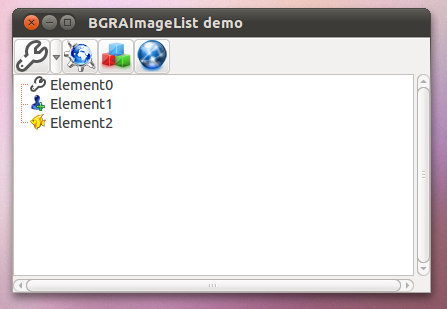
An image list that supports alpha in all supported platforms.
How app looks with TImageList (with transparent icons):
How app looks with BGRAImageList:
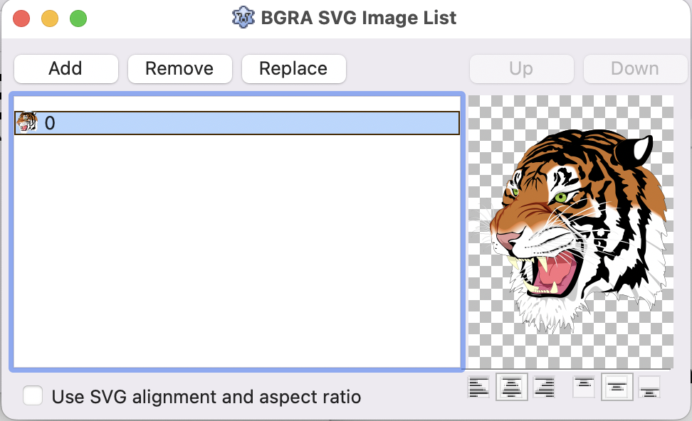
TBGRASVGImageList
It is located in the BGRA Themes tab.
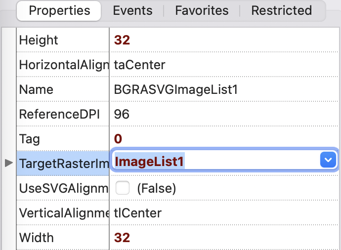
In its properties, one can define the size and a target raster image list (TImageList or TBGRAImageList):
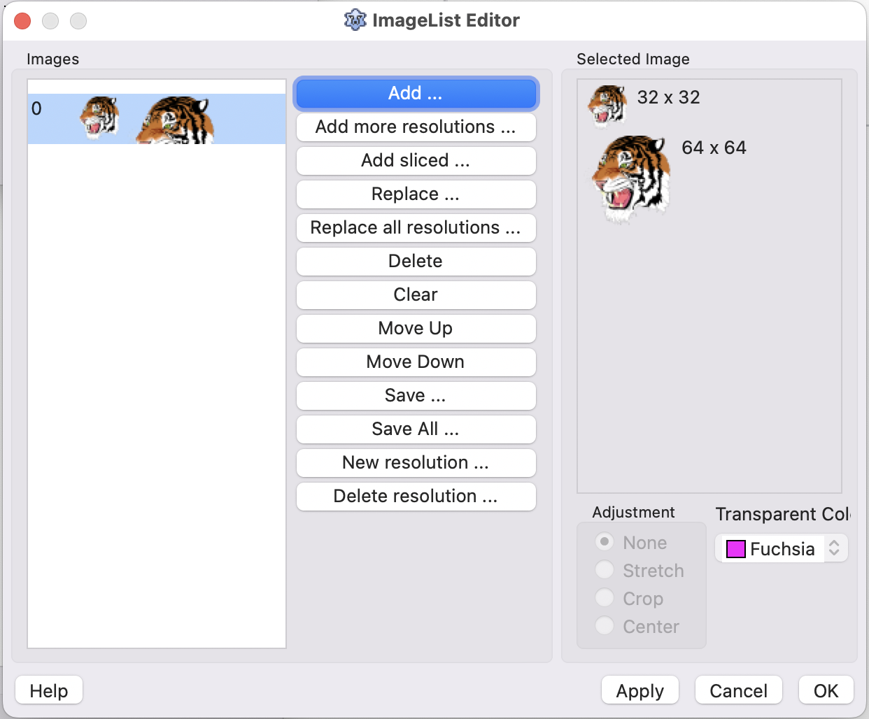
This will automatically populate the target image list (here on MacOS, it provides the double sized icons for Retina):
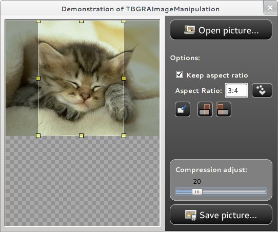
TBGRAImageManipulation
A tool to manipulate pictures, see the demo that shows all the capability that comes with it.
TBGRAKnob
A knob that can be styled through properties.
TBGRAResizeSpeedButton
A speed button that can resize the glyph to fit in the entire control.
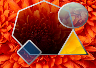
TBGRAShape
A control with configurable shapes like polygon and ellipse that can be filled with gradients and can have custom borders and many other visual settings.
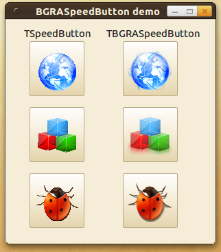
TBGRASpeedButton
A speed button that in GTK and GTK2 provides BGRABitmap powered transparency to the glyph.
TBGRASpriteAnimation
A component that can be used as image viewer or animation viewer, supports the loading of gif files.
TBGRAVirtualScreen
Is like a panel. You can draw this control using the OnRedraw event.
TDTAnalogClock
A clock.
TDTAnalogGauge
A gauge.
TDTThemedClock
Another clock.
TDTThemedGauge
Another gauge.
TPSImport_BGRAPascalScript
A component to load BGRABitmap pascal script utilities.
BGRA Custom Drawn
BGRA Custom Drawn is a set of controls inherited from Custom Drawn. These come with a default dark style that is like Photoshop.
TBCDButton
A button control that is styled with TBGRADrawer.
TBCDEdit
An edit control that is styled with TBGRADrawer.
TBCDStaticText
A label control that is styled with TBGRADrawer.
TBCDProgressBar
A progress bar control that is styled with TBGRADrawer.
TBCDSpinEdit
A spin edit control that is styled with TBGRADrawer.
TBCDCheckBox
A check box control that is styled with TBGRADrawer.
TBCRadioButton
A radio button that is styled with TBGRADrawer.
Sample code
BGRA Controls comes with nice demos to show how to use the stuff and extra things you can use in your own projects.
Pascal Script Library
Putting BGRABitmap methods into a .dll with c#, java and pascal headers.
BGRA Ribbon Custom
How to create a fully themed window using the controls to achieve a Ribbon like application.
Tests
There are test for analog controls (clock and gauge), BC prefixed controls, BGRA prefixed controls, BGRA Custom Drawn controls, how to use Pascal Script and BGRABitmap, bgrascript or how to create your own scripting solution with BGRABitmap.
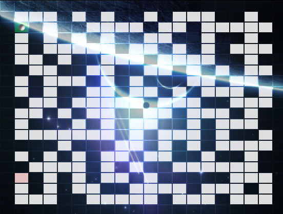
Tests Extra
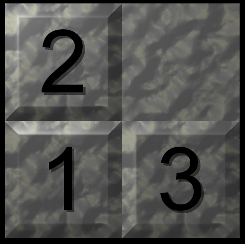
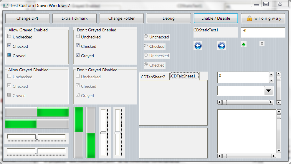
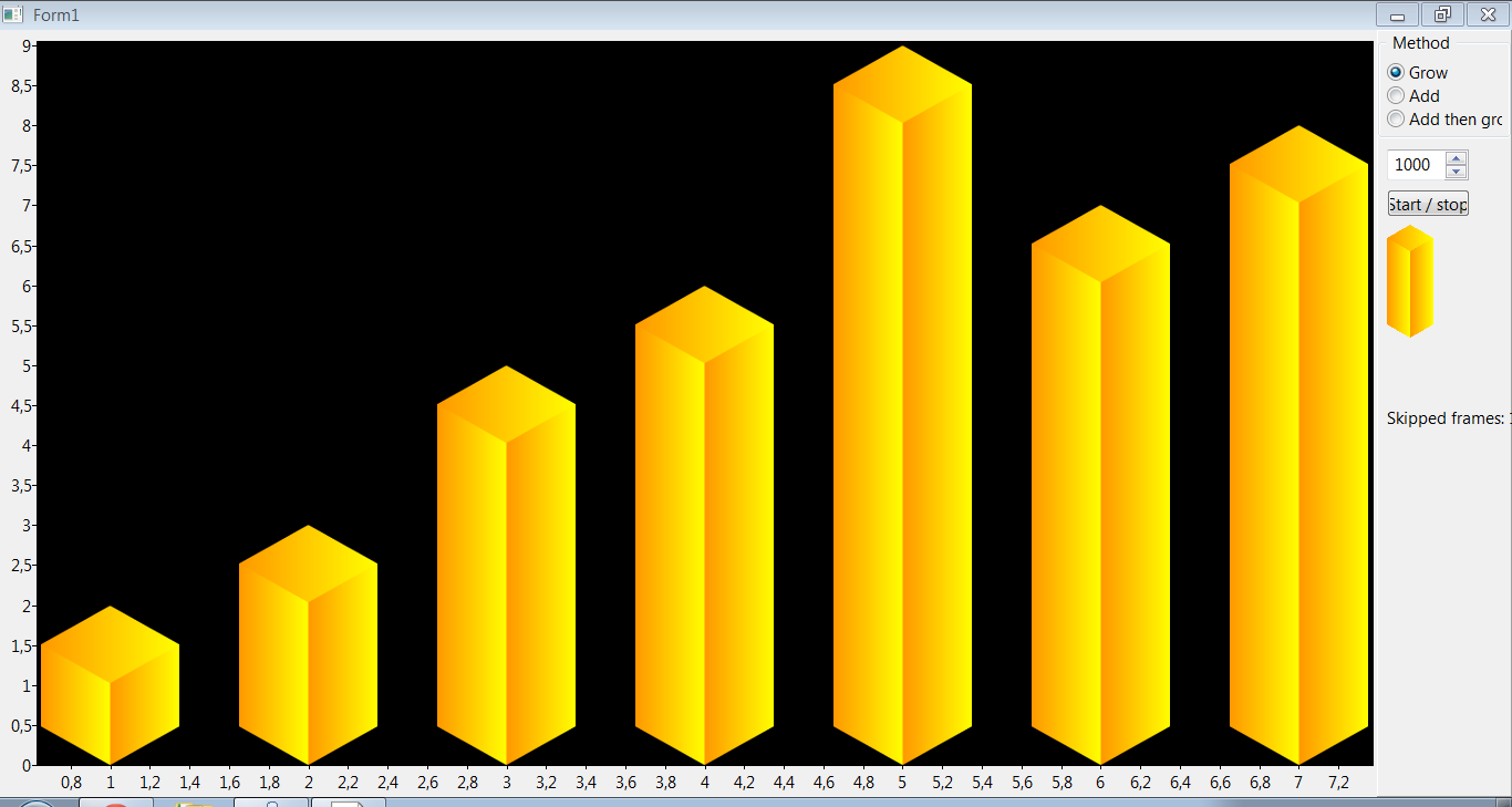
These are extra tests like how to use fading effect, an fpGUI theme, games like maze and puzzle, how we created the material design animation, pix2svg or how to convert a small picture to svg using hexagons, rectangles and ellipses, plugins or how to load .dlls and use into a TBGRAVirtualScreen, rain effect, shadow effect, 9-slice-scaling with Custom Drawn or how to theme with bitmaps an application to look like Windows themes and 9-slice-scaling with charts.
Other units
These units come with BGRA Controls and contains more functionality that is sometimes used with the controls, sometimes not but are usefull in some way. Some are listed here, others you can see linked directly with any control like bcrtti, bcstylesform, bctools and bctypes.
BCEffect
Fading effect with BGRABitmap.
BCFilters
A set of pixel filters to use with BGRABitmap.
BGRAScript
Scripting with BGRABitmap, see test project.
Related Articles
BGRASpriteAnimation - Usage of the sprite animation component.
uE_Controls - Other controls developed with BGRABitmap.
BGRABitmap - The library used to create this controls.
LazPaint - A paint program developed with Lazarus and BGRABitmap.
