|
|
| Line 95: |
Line 95: |
| | | | |
| | ==== TECPositionBar ==== | | ==== TECPositionBar ==== |
| | + | |
| | + | [[File:tecpositionbar.png]] |
| | | | |
| | ==== TECSpinPosition ==== | | ==== TECSpinPosition ==== |
| | + | |
| | + | [[File:tecspinposition.png]] |
| | | | |
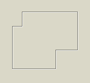
| | ==== TECRuler ==== | | ==== TECRuler ==== |
| | + | |
| | + | [[File:tecruler.png]] |
| | | | |
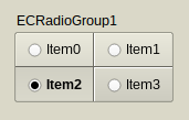
| | ==== TECRadioGroup ==== | | ==== TECRadioGroup ==== |
| | + | |
| | + | [[File:tecradiogroup.png]] |
| | | | |
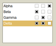
| | ==== TECCheckGroup ==== | | ==== TECCheckGroup ==== |
| | + | |
| | + | [[File:teccheckgroup.png]] |
| | | | |
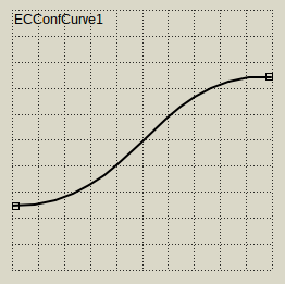
| | ==== TECConfCurve ==== | | ==== TECConfCurve ==== |
| | + | |
| | + | [[File:tecconfcurve.png]] |
| | | | |
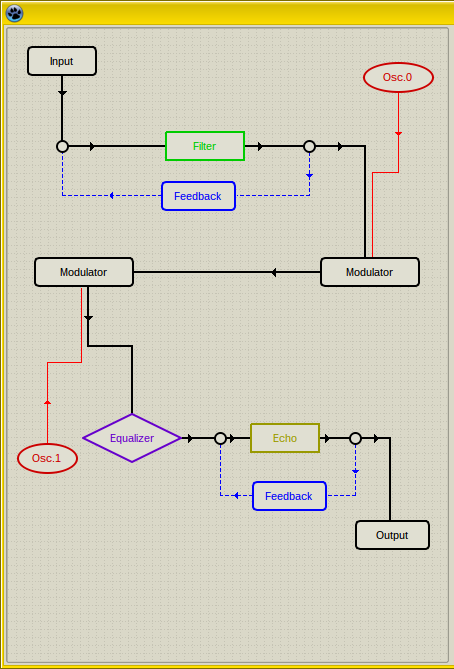
| | ==== TECScheme ==== | | ==== TECScheme ==== |
| | + | |
| | + | [[File:tecscheme.png]] |
| | | | |
| | === Non-visual components === | | === Non-visual components === |
| | | | |
| | ==== TECSpinController ==== | | ==== TECSpinController ==== |
| | + | |
| | + | [[File:tecspincontrollericon.png]] |
| | | | |
| | ==== TECTimer ==== | | ==== TECTimer ==== |
| | | | |
| | + | [[File:tectimericon.png]] |
| | | | |
| − |
| |
| − | == BC ==
| |
| − | === BCButton ===
| |
| − | [[Image:bcbutton.png]]
| |
| − | === BCGameGrid ===
| |
| − | [[Image:bcgamegrid.png]]
| |
| − | === BCImageButton ===
| |
| − | The bitmap must contain 4 states (from top to bottom, with the same Height) in the following order: normal, hover, active, disabled.
| |
| − |
| |
| − | ''Example Button:''
| |
| − |
| |
| − | [[Image:samplebgraimagebutton.png]]
| |
| − |
| |
| − | ''Example Button (with Alpha):''
| |
| − |
| |
| − | [[Image:samplebgraimagebuttonalpha.png]]
| |
| − |
| |
| − | === BCXButton ===
| |
| − | Fully customizable button with 'OnRenderControl' event. This control doesn't has default properties, it's supposed that you will override this control and add all the things you wish.
| |
| − |
| |
| − | - Like TCDButton (Custom Drawn Button).
| |
| − |
| |
| − | - Call 'OnRenderControl' event (like a Drawer in CD) for each button, or one for all buttons.
| |
| − |
| |
| − | - Create fully customizable buttons, like using BGRAVirtualScreen or BCGraphicControl.
| |
| − |
| |
| − | [[Image:bcxbutton.png]]
| |
| − |
| |
| − | === BCLabel ===
| |
| − | [[Image:bclabel.png]]
| |
| − |
| |
| − | === BCPanel ===
| |
| − | [[Image:bcpanel.png]]
| |
| − |
| |
| − | == BGRA ==
| |
| − | === BGRAProgressBar ===
| |
| − | '''Use as replace of:''' TProgressBar
| |
| − |
| |
| − | [[Image:BC-Bgraflashprogressbar.png]]
| |
| − |
| |
| − | Flash progressbar created by circular.
| |
| − |
| |
| − | === BGRAGraphicControl ===
| |
| − | '''Use as replace of:''' TPaintBox
| |
| − |
| |
| − | TBGRAGraphicControl, which allows to draw your component by yourself with alpha blending.
| |
| − |
| |
| − | === BGRAImageList ===
| |
| − | '''Use as replace of:''' TImageList
| |
| − |
| |
| − | '''Before:'''
| |
| − |
| |
| − | [[Image:before-TImageList.png]]
| |
| − |
| |
| − | '''After:'''
| |
| − |
| |
| − | [[Image:after-TBGRAImageList.png]]
| |
| − |
| |
| − | Component which inherits from TImageList. So each control (tested on TToolBar and TTreeView) which is using TImageList.Draw method for drawing icons, automatically can have alpha support. Just use this component instead of TImageList. This component has been written for enabling GTK alpha, so on Windows (and other interfaces) it works just like normal TImageList (it doesn't use BGRABitmap for drawing).
| |
| − |
| |
| − | === BGRAImageManipulation ===
| |
| − | '''Use as replace of:''' TImage
| |
| − |
| |
| − | Component to facilitate the importation of images in an application.
| |
| − |
| |
| − | In the current version you can import an image and cut out keeping the aspect ratio (or not). For example, if you want to import photos using the 3x4 ratio, adjust the 'ratio' property to 3:4. If import an image with different size, the component will ensure that the image meets the proportions of the desired dimensions.
| |
| − |
| |
| − | You can determine the minimum size of the image adjusting the properties 'MinWidth'and 'MinHeight'.
| |
| − |
| |
| − | You can rotate the image using functions builtin.
| |
| − |
| |
| − | See demo of component:
| |
| − |
| |
| − | [[Image:bgraimagemanipulation.jpg]]
| |
| − |
| |
| − | After retrieving the image modified by the component, just put the image into your destination using the stretch. It is obvious that the target must have the same ratio chosen on component for do not distort the final result.
| |
| − |
| |
| − | === BGRAKnob ===
| |
| − | [[Image:BC-Bgraknob.png]]
| |
| − |
| |
| − | Graphic knob component created by circular.
| |
| − |
| |
| − | === BGRAShape ===
| |
| − | '''Use as replace of:''' TShape
| |
| − |
| |
| − | [[Image:samplebgrashape.png]]
| |
| − |
| |
| − | The component has full alpha support and you can put the number of polygons you want with rounded borders & gradients (linear, radial, diamond, reflected).
| |
| − |
| |
| − | === BGRASpeedButton ===
| |
| − | '''Use as replace of:''' TSpeedButton
| |
| − |
| |
| − | [[Image:BGRASpeedButton.png]]
| |
| − |
| |
| − | Component which inherits from TSpeedButton and draws the glyph using TBGRABitmap. This component has been written for enabling GTK alpha, so on Windows (and other interfaces) it works just like normal TImageList (it doesn't use BGRABitmap for drawing).
| |
| − |
| |
| − | === BGRASpriteAnimation ===
| |
| − | '''Use as replace of:''' TImage
| |
| − |
| |
| − | Read more in the article [[BGRASpriteAnimation]].
| |
| − |
| |
| − | [[Image:bgraspriteanimation.png]]
| |
| − |
| |
| − | With this you can do animations from bitmap. You need an image with all the frames layout in in a horizontal position.
| |
| − |
| |
| − | It has the ability to specify how many times the animation should be played (0 for infinite, 1, 2, etc) and static to stop the animation, is capable to specify the speed and direction and support transparency.
| |
| − |
| |
| − | Features:
| |
| − | * Animation: invert, position, lap, speed, static, repeat.
| |
| − | * Sprite: fill opacity (global transparency), flip mode (horizontal, vertical, both), key color (transparent color), resample (normal or fine resample modes). AutoSize.
| |
| − | * AnimatedGifToSprite: convert an animated gif to a BGRABitmap sprite.
| |
| − |
| |
| − | === BGRAVirtualScreen ===
| |
| − | '''Use as replacement of:''' TPanel, TPaintBox
| |
| − |
| |
| − | The principle is to draw on a memory bitmap.
| |
| − |
| |
| − | The component has a specific event, OnRedraw, which is called when the whole bitmap needs to be redrawn. It happens at the beginning and when the component is resized. You can also query to redraw the bitmap with Redraw and DiscardBitmap methods. The second one only invalidates the content, which can wait until the messageloop is handled.
| |
| − |
| |
| − | Otherwise, it is possible to modify the Bitmap property and call Invalidate or Repaint, to avoid erasing the whole bitmap content.
| |
| − |
| |
| − | == Test ==
| |
| − | === Game - Maze ===
| |
| − | [[Image:game_maze.png]]
| |
| − |
| |
| − | === Game - Puzzle ===
| |
| − | [[Image:game_puzzle.png]]
| |
| − |
| |
| − | === SliceScaling - CustomDrawn Windows 7 ===
| |
| − |
| |
| − | [[Image:customdrawnwindows7.png]]
| |
| − |
| |
| − | This is a drawer for [[Lazarus Custom Drawn Controls]], you need that component installed with the latest Lazarus revision to work.
| |
| − |
| |
| − | Working in this drawer: button, statictext, checkbox, radiobutton and progressbar.
| |
| − |
| |
| − | This has also extra images for 'Luna' (Windows XP Theme) 'Aero Lite' (Windows 8 Theme) and extra buttons (arrows).
| |
| − |
| |
| − | === SliceScaling - TAChart ===
| |
| − |
| |
| − | 9-slice scaling is usefull to create sizable UI elements like in the Custom Drawn Windows 7 Drawer.
| |
| − |
| |
| − | There's a [[TAChart]] example with slice scaled bars.
| |
| − |
| |
| − | [[File:slicescaledtachart.png]]
| |
| | | | |
| | [[Category:Components]] | | [[Category:Components]] |
