Difference between revisions of "SplashAbout/Advanced Use"
m (Added screenshots. Still work-in-progress....) |
m |
||
| Line 1: | Line 1: | ||
| − | |||
*For installation, download, version and other information, see the [[SplashAbout]] page. | *For installation, download, version and other information, see the [[SplashAbout]] page. | ||
| + | ---- | ||
| + | |||
| + | |||
==Properties== | ==Properties== | ||
When dropped onto a new application mainform, the property defaults will show a Splash Screen and About window that look something like this: | When dropped onto a new application mainform, the property defaults will show a Splash Screen and About window that look something like this: | ||
| Line 79: | Line 81: | ||
**CreditsTextFileName | **CreditsTextFileName | ||
**ShowCreditButton | **ShowCreditButton | ||
| + | ---- | ||
==How To...== | ==How To...== | ||
===How to show a shaped Splash screen=== | ===How to show a shaped Splash screen=== | ||
| Line 91: | Line 94: | ||
If you choose saUserMask then you need to make a 2-colour mask graphic in the .BMP format. You can optionally also make a corresponding BitMapMaskColor image. | If you choose saUserMask then you need to make a 2-colour mask graphic in the .BMP format. You can optionally also make a corresponding BitMapMaskColor image. | ||
Note: There are some example images deployed in the /exampleapp folder of the distribution archive | Note: There are some example images deployed in the /exampleapp folder of the distribution archive | ||
| − | |||
=====How to make a BitMapMaskMono image===== | =====How to make a BitMapMaskMono image===== | ||
*Start with a black (RGB:0,0,0)background | *Start with a black (RGB:0,0,0)background | ||
Revision as of 17:14, 2 June 2014
- For installation, download, version and other information, see the SplashAbout page.
Properties
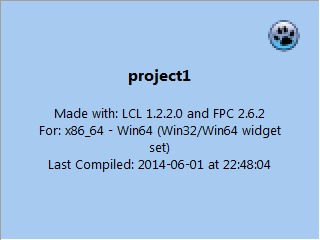
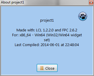
When dropped onto a new application mainform, the property defaults will show a Splash Screen and About window that look something like this:
- A normal (borderless rectangle) Splash screen displayed for 2 seconds (ShowSplash method)
- It will use the Application default icon (default=Lazarus icon)
- Title will be the Application name (default='project1')
- Colour will be clSkyBlue
- No background image
- No description
- Window size = 320px x 240px
- LCL and FPC build text
- Compilation Date/Time text
- The About screen will show (ShowAbout method)
- No License or Credits buttons
- The same text as the default Splash Screen
The default screens are probably OK for a quick one-off app that is not for commercial use. It shows useful information.
However; if you think they look a bit uninspiring, the SplashAbout component is capable of considerable customisation from its default settings, and there are many properties available to help you achieve a unique and very inspiring result.
Here are the SplashAbout properties you can change for each kind of customisation:
Personalising the Splash screen
- Properties that affect the Splash Screen:
- The Application Title,Icon and VersionInfo (set in Project/Options)
- BackGroundColor
- BitMapBackground
- BitmapMaskColor
- BitmapMaskMono
- DelaySeconds
- Description
- Font
- FormSplashHeight
- FormSplashTextAlign
- FormSplashWidth
- Graphics
- Icon
- MaskType
- Organisation
- ShowDecription
- ShowPoweredBy
- TitleStyle
- UserTitle
Personalising the About screen
- Properties that affect the About Screen:
- The Application Title,Icon and VersionInfo (set in Project/Options)
- Author
- BackGroundColor
- CreditLines
- CreditsTextFileName
- Description
- Font
- FormAboutHeight
- FormAboutTextAlign
- FormAboutWidth
- Graphics
- Icon
- LicenseFile
- Orgnisation
- ShowCreditButton
- ShowDecription
- LicenseFile
- SupportContact
- TitleStyle
- UserTitle
Personalising the License Screen
- Properties that affect the License Screen:
- Author
- LicenseFile
- Organisation
- SupportContact
Personalising the Credits Screen
- Properties that affect the Credits Screen:
- CreditLines
- CreditsTextFileName
- ShowCreditButton
How To...
How to show a shaped Splash screen
Properties to set:
- BitmapMaskColor (Graphics=saResources)
- BitmapMaskMono (Graphics=saResources)
- MaskType
- Graphics
MaskType
- Default=saNoMask
The simple thing to do is to choose one of the built-in masks (saRoundedRect, saBigCog, saBigFlower and saBigSplash) If you choose saUserMask then you need to make a 2-colour mask graphic in the .BMP format. You can optionally also make a corresponding BitMapMaskColor image. Note: There are some example images deployed in the /exampleapp folder of the distribution archive
How to make a BitMapMaskMono image
- Start with a black (RGB:0,0,0)background
- Make your contigious shape using a white (RGB:255,255,255) shape
- Reduce the image to a 2-color palette
- Save the file as a Windows Bitmap (.BMP) and use it to set the BitmapMaskColor property
- It should NOT be run-length encoded (RLE)
If you want a shaped colour splash screen then you need to make a corresponding BitMapColor image
How to make a BitmapMaskColor image
You would normally do this before making the BitmapMaskColor image
- Make with an colour image that has a white (RGB:255,255,255) background
- You can use a selection tool to isolate the background then paint it white in a graphics application
- Save the file as a .JPG and use it to set the BitmapMaskColor property
- To make a corresponding BitmapMaskColor image:
- Invert the selection, and paint it black (RGB:0.0.0)
- Reduce the image to a 2-color palette
- Save the new image as a non-RLE Windows Bitmap file (.BMP) and use it to set the BitmapMaskMono property

