Reference: MSEgui/TWidget
TWiget
Ready for revision
Ancestor for visual components.
Reference
Hierarchy
 TObject
   │
   ╰─┬─TPersistent
     │
     ╰─┬─TComponent
       │
       ╰─┬─TmseComponent
         │
         ╰─┬─TactComponent
           │
           ╰───TWidget
Properties
Anchors
Anchors combines the traditional Anchors and the traditions Align properties.
property anchors: anchorsty read fanchors write setanchors default defaultanchors;
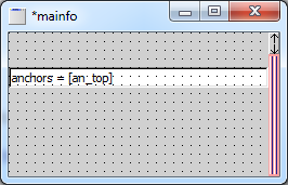
By default your anchors are an_left and an_top. Then your widget stays at the same position when sizing the form. When your widget should have a constant distance to the right border of its parent, you add an_right and remove an_left (in this order...). The same you can do with an_bottom and an_top.
If you have only one anchor, and the widget is suitable for this sizing, the widget is using the full size of the not anchored dimension. The behaviour is near the traditional property Align, but the widget is not aligned directly to the border, but you can free position it.
By having no anchors set, the widget fills the client size of its parent (the traditional alClient).
By setting an_left and an_top, the widget change its horizontal size by sizing its parent, the same with the vertical size by setting an_top and an_bottom together.
Bounds
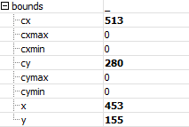
The size and the position of the widget is condensed in the property bounds, but you have also the traditional properties like left an width.
// the types
sizety = record
  cx, cy: integer;
end;

pointty = record
  x,y: integer;
end;

rectty = record
case integer of
  0: (x, y, cx, cy: integer);
  1: (pos: pointty; size: sizety);
end;


// the properties
property Widgetrect: rectty read FWidgetrect write SetWidgetrect;
property Pos: pointty read FWidgetrect.pos write SetPos;
property Size: sizety read FWidgetrect.size write SetSize;

property Bounds_x: integer read FWidgetrect.x write SetBounds_x;
property Bounds_y: integer read FWidgetrect.y write SetBounds_y;
property Bounds_cx: integer read FWidgetrect.cx write SetBounds_cx
               {default defaultwidgetwidth} stored true;
property Bounds_cy: integer read FWidgetrect.cy write SetBounds_cy
               {default defaultwidgetheight} stored true;
property Bounds_cxmin: integer read FMinSize.cx
                                   write SetBounds_cxmin default 0;
property Bounds_cymin: integer read FMinSize.cy
                                   write SetBounds_cymin default 0;
property Bounds_cxmax: integer read FMaxSize.cx
                                   write SetBounds_cxmax default 0;
property Bounds_cymax: integer read FMaxSize.cy
                                   write SetBounds_cymax default 0;

property Left: integer read FWidgetrect.x write SetBounds_x;
property Right: integer read GetRight write SetRight;
             //widgetrect.x + widgetrect.cx, sets cx if an_left is set
property Top: integer read FWidgetrect.y write SetBounds_y;
property Bottom: integer read GetBottom write SetBottom;
             //widgetrect.y + widgetrect.cy, sets cy if an_top is set
property Width: integer read FWidgetrect.cx write SetBounds_cx;
property Height: integer read FWidgetrect.cy write SetBounds_cy;

property MinSize: sizety read FMinSize write SetMinSize;
function WidgetMinSize: sizety;
        //calls checkwidgetsize and frame.checkwidgetsize
property MaxSize: sizety read FMaxSize write SetMaxSize;
Color
property Color: colorty default defaultwidgetcolor;
Specifies the color of the widget. With Face and Frame other colors for the whole or a part of the widget can set.
Cursor
property Cursor: cursorshapety default cr_default;
Specifies the look of the mouse cursor if it is over the widget.
Enabled
property Enabled: boolean default true;
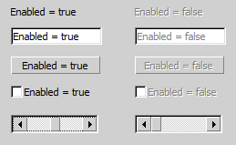
Sets the widget enabled or not. Some Widgets change their look if they are not enabled, others do not (UPDATE: Meanwhile TSlider change it's look when setting enabled).
Face
See TFace
Font
See TFont
Frame
See TFrame
Hint
A hint is a small text displayed when the mouse cursor is over the widget. With the text editor of the object inspector you can add additional lines (SHIFT+ENTER), you can also use [r[n:
Label1.Hint := 'This is a simple hin text[r[nof a simple label[r[nwith more than on line.'
See also OnHint
OptionsWidget
optionwidgetty = (ow_background, ow_top, ow_ultratop,
  ow_noautosizing, //don't use, moved to optionswidget1
  ow_mousefocus, ow_tabfocus, ow_parenttabfocus, ow_arrowfocus,
  ow_arrowfocusin,ow_arrowfocusout,
  ow_subfocus, //reflects focus to children
  ow_focusbackonesc,
  ow_keyreturntaborder, //key_return and key_enter work like key_tab
  ow_nochildshortcut,  //do not propagate shortcuts to parent
  ow_noparentshortcut, //do not react to shortcuts from parent
  ow_canclosenil,      // don't use, moved to optionswidget1
  ow_mousetransparent, ow_mousewheel, ow_noscroll,
  ow_nochildpaintclip, ow_nochildclipsiblings,
  ow_destroywidgets, ow_nohidewidgets,
  ow_hinton, ow_hintoff, ow_disabledhint, ow_multiplehint, ow_timedhint);
optionswidgetty = set of optionwidgetty;

property OptionsWidget: optionswidgetty;
- With ow_background and ow_top you can influence the so named Z-order, also which widget is dran over another. Without that option the Z-order goes in the order of inserting the widgets on the form.
- The options ow_background and ow_top you can also use with forms. There you have additional the option ow_ultratop, which doesn't matter within forms.
- If ow_mousefocus is set, the widget can get the focus by clicking on it.
- If ow_tabfocus is set, the widget can get the focus using the tab key. See also TabOrder.
- If ow_arrowfocus is set, the widget can get the mouse focus using the arrow keys.
- ow_arrowfocusin and ow_arrowfocusout are for widgets with child widgets. If ow_arrowfocusin ist set, you can jump with the arrows keys into one of these child widgets, if ow_arrowfocusout is set, you can jump with the arrows keys from one of the child widgets to one outside.
- If a widget gets focus, ow_subfocus causes that it immediately focuses a child widget. Used for containerwidgets like TGroupBox.
- With ow_focusbackonesc you can set the focus to the last widget got the focus before the current one with the ESC key. (You don't go back in inverse tab order, multiple pressed ESC changes the focus between only two widgets).
- If you set ow_keyreturntaborder you can move in tab order with the RETURN key.
- If ow_mousetransparent is set, the widget itself (not the child widgets) do not react on mouse events.
- With ow_mousewheel you can specify, if the widget process mouse wheel events or not (provided, the widget processes mouse wheel events at all).
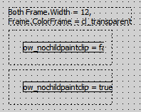
- With ow_nochildpaintclip you can draw in the Frame of your widget (it's visible if FrameColor ist cl_transparent); see the following picture:
- Normally before a widget paints a child it removes the opaque areas of overlapping siblings of the child from the painting region of the canvas. ow_nochildclipsiblings inhibits this.
- To show a hint although the parent doesn't use ow_hinton; to do not show a hint although the parent do, use ow_hintoff.
- By default a disabled widget shows the hint of its parent (if it have one). To show its own hint set ow_disabledhint.
- By default a hint is shown only once - to see it again you have first to show the hint of another widget (or restart your application). To see the hint as often you move the mouse over the widget, use ow_multiplehint.
- By default the hint is shown as long as the mouse is over the widget. To hide the hint automatically set ow_timedhint.
OptionsWidget1
optionwidget1ty = (ow1_fontglyphheight, //track font.glyphheight, create fonthighdelta and childscaled events
  ow1_fontlineheight, //track font.linespacing, create fonthighdelta and childscaled events
  ow1_autoscale, //synchronizes bounds_cy or bonds_cx with fontheightdelta
  ow1_autowidth, ow1_autoheight,
  ow1_autosizeanright, ow1_noautosizeanright,
  ow1_autosizeanbottom, ow1_noautosizeanbottom,
  ow1_noparentwidthextend, ow1_noparentheightextend,
  ow1_canclosenil, //call canclose(nil) on exit
  ow1_nocancloseifhidden,
  ow1_modalcallonactivate, ow1_modalcallondeactivate, //used in tactionwidget
  ow1_noautosizing //used in tdockcontroller );
optionswidget1ty = set of optionwidget1ty;

property OptionsWidget1: optionswidget1ty;
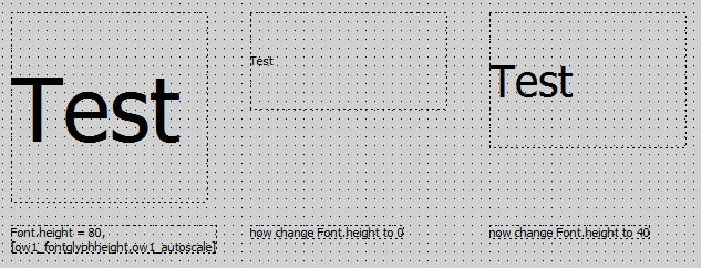
- The meaning of ow1_autoscale shows the following picture. Please note that ow1_autowidth and ow1_autoheight aren't set. If you reduce the Font.Height from 80 to 0 (which means a default value), than the height of the widget reduces by the amount of less pixels the text is needed. Vice versa if you increase Font.Height.
- ow1_autoheight causes the widget to set the height following the font size. The text to display doesn't matter.
- ow1_autowidth causes the widget to set the width following the font size and the text to display. At widgets like TEdit ow1_autowidth is not set by default.
- On a left anchored widget ow1_autowidth causes the widget to extend to the right. With ow1_autosizeanright = true you can extent it to the left; see the following picture:
- On a right anchored widget ow1_autowidth causes the widget to extend to the left. With ow1_noautosizeanright = true you can extent it to the right.
- On a top anchored widget ow1_autoheight causes the widget to extend to the bottom. With ow1_autosizeanbottom = true you can extent it to the top.
- On a bottom anchored widget ow1_autoheight causes the widget to extend to the top. With ow1_noautosizeanbottom = true you can extent it to the bottom.
- The options ow1_noparentwidthextend and ow1_noparentheightextend are usually used together with scrolling widgets like TScrollBox or with TExpandingWidget. These widgets change their size or scrolling area regarding to their child widgets. If you want to take a widget not in account to define the width, set ow1_noparentwidthextend, the same for the height with ow1_noparentheightextend.
- If ow1_canclosenil is set, the function CanClose with NIL as "newfocus" parameter is additionally executed when the Widget should loose the focus. To inhibit this, the function have to return false. The virtual function CanClose returns true by default, but can be overrided and also execute CanClose of all child widgets. TWidget.CanClose(<newfocusedwidget>) is called anyway by changing the focused widget in a form. ow1_canclosenil additionally calls canclose(nil) which simulates closing the form. Some widgets distinguish between loosing focus to another widget of the form or by closing the form. For example in a data entry form mandatory fields need to be checked for CanClose(nil).
- To prevent CanClose from doing anything if the widget is not visible, set ow1_nocancloseifhidden.
- If a form is shown modal, it gets the activation if it is shown and it loose the activation on closing. Inbetween there is no activation change. Therefore the events OnActivate and OnDeactivate are normally not triggered on modal widgets. To do this yet, use ow1_modalcallonactivate and ow1_modalcallondeactivate.
PopupMenu
Reference on a TPopupMenu instance, showing with a rightclick on the widget. See also OnPopup
property PopupMenu: TPopupMenu;
TabOrder
property TabOrder: integer;
Specifys in which order the widgets get the focus if you use the tab key. (See also ow_tabfocus in OptionsWidget.)
Visible
property Visible: boolean default true;
Sets the widget visible or hides it.
Methods
Please suggest here methodes to describe wich are used for working with the widget, not for internal.
Events
OnHint
showhinteventty = procedure(const Sender: TObject; var Info: hintinfoty) of object;
The event OnHint is triggered, when a hint is displayed for the widget. With the var-parameter Info you can specify details of the displayed hint.
procedure tmainfo.FormShowHint(const Sender: TObject; var Info: hintinfoty);
begin
  Info.Caption := 'Trololo';
  Info.PosRect.X := Info.PosRect.X + 60;
  Info.PosRect.y := Info.PosRect.y - 20;
end;
OnEnter, OnFocus, OnActivate
We have three pairs of events regarding the change of a focus:
property OnEnter: notifyeventty;
property OnExit: notifyeventty;

property OnFocus: notifyeventty;
property OnDeFocus: notifyeventty;

property OnActivate: notifyeventty;
property OnDeActivate: notifyeventty;
For an example we have two forms with both have two edits. The main form has an memo to log the events (here an example for OnEnter):
procedure ttestfo.FormEnter(const Sender: TObject);
begin
  MainFo.DoLog((Sender as TWidget).Name + ' OnEnter');
end;
We click on the first form:
- Form1 OnEnter
- Form1_Edit1 OnEnter
- Form1_Edit1 OnFocus
- Form1 OnActivate
- Form1_Edit1 OnActivate
Now we click on the second edit of the first form:
- Form1_Edit1 OnDeFocus
- Form1_Edit1 OnDeActivate
- Form1_Edit1 OnExit
- Form1_Edit2 OnEnter
- Form1_Edit2 OnActivate
- Form1_Edit2 OnFocus
Now we click on then second form:
- Form2 OnEnter
- Form2_Edit1 OnEnter
- Form2_Edit1 OnFocus
- Form1_Edit2 OnDeActivate
- Form1 OnDeActivate
- Form2 OnActivate
- Form2_Edit1 OnActivate
Now we click on the second edit of the first form (which was formerly focused on the first form):
- Form2_Edit1 OnDeActivate
- Form2 OnDeActivate
- Form1 OnActivate
- Form1_Edit2 OnActivate
And now we click on the second edit for the second form:
- Form1_Edit2 OnDeActivate
- Form1 OnDeActivate
- Form2 OnActivate
- Form2_Edit1 OnActivate
- Form2_Edit1 OnDeFocus
- Form2_Edit1 OnDeActivate
- Form2_Edit1 OnExit
- Form2_Edit2 OnEnter
- Form2_Edit2 OnActivate
- Form2_Edit2 OnFocus
In the last step we see first an complete activation change of the form (goes to Form2_Edit1) and than a complete focus change from Form2_Edit1 to Form2_Edit2.
We see:
- OnFocus and OnDeFocus only the widget which have the focus, here TEdit.
- OnEnter is the first event if a widget gets the focus, OnEnter is the last event if a widget loose the focus. On a focus change, OnEnter of the focus getting widget is following directly on OnExit of the focus loosing widget.
- Changing the form fires only OnActivate and OnDeActivate (but not only the changing of the forms fires them). (First OnDeactivate of the widget, than OnDeactivate of the form, then OnActivate of the form, then OnActvate of the widget.)
If ow_ArrowFocus is in OptionsWidget of the regarding widgets, you can change the focus with the arrow keys. The parent component has an algorithm to select the next widget for each arrow key, and at the end of this algorithm the event OnNavigRequest is fired. Here you can overwrite some values.
graphicdirectionty = (gd_right,gd_up,gd_left,gd_down,gd_none);

naviginfoty = record
  sender: twidget;
  direction: graphicdirectionty;
  startingrect: rectty;
  distance: integer;
  nearest: twidget;
  down: boolean;
  hastarget: boolean;
end;

navigrequesteventty = procedure(const Sender: twidget; var AInfo: naviginfoty) of object;

property OnNavigRequest: navigrequesteventty
The most likely case may be, that you want to set the focus to another widget. In the following example the focus goes always to Edit9. Make sure, that you use the OnNavigRequest of the parent widget.
procedure tmainfo.FormNavigRequest(const Sender: TWidget; var AInfo: naviginfoty);
begin
  AInfo.Nearest := Edit9;
end;
OnPaint, OnPaintBackground, OnAfterPaint, OnPaintBackground
The OnPaint-Events are fired before, while or after the widget is painted.
painteventty = procedure (const Sender: TWidget; const ACanvas: TCanvas) of object;

property OnBeforePaint: painteventty;
property OnPaintBackground: painteventty;
property OnPaint: painteventty;
property OnAfterPaint: painteventty;
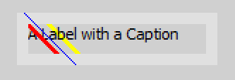
The following example shows, when the events are fired:
- The first is OnBeforePaint. You don't see the green line, cause its overdrawn, but you see the two following lines with a width of 3.
- The next is OnPaintBackground. You see the yellow line, but the Caption of the button is drawn over it.
- OnPaint is drawn after the Caption is drawn, the red line is over it.
- The last is OnAfterPaint, its fired after the frame is drawn so you can draw over the frame. The line width is resetted, if you want a higher line width, you have set it new.
procedure tmainfo.LabelPaint(const Sender: TWidget; const ACanvas: TCanvas);
begin
  ACanvas.DrawLine(mp(-30, -30), mp(150, 150), cl_red);
end;

procedure tmainfo.LabelAfterPaint(const Sender: TWidget; const ACanvas: TCanvas);
begin
  ACanvas.DrawLine(mp(-25, -30), mp(155, 150), cl_blue);
end;

procedure tmainfo.LabelBeforePaint(const Sender: TWidget; const ACanvas: TCanvas);
begin
  ACanvas.LineWidth := 3;
  ACanvas.DrawLine(mp(-20, -30), mp(160, 150), cl_green);
end;

procedure tmainfo.LabelPaintBackground(const Sender: TWidget; const ACanvas: TCanvas);
begin
  ACanvas.DrawLine(mp(-15, -30), mp(165, 150), cl_yellow);
end;
OnPopup
The event OnPopup is fired if you show the PopupMenu by clicking with the right mouse button, but not, if you show the PopupMenu manually by TPopupMenu.Show.
popupeventty = procedure(const Sender: TObject; var AMenu: TPopupMenu; var MouseInfo: mouseeventinfoty) of object;
You can use AMenu to assign a TPopupMenu-Instance in this moment. With MouseInfo you have some information like Position or shift state and can also change them:
procedure tmainfo.LabelPopup(const Sender: TObject; var AMenu: TPopupMenu; var MouseInfo: mouseeventinfoty);
begin
  AMenu := PopupMenu1;
  MouseInfo.Pos.X := MouseInfo.Pos.X + 300;
end;
OnBeforeUpdateSkin, OnAfterUpdateSkin
Inherited from TMseComponent: OnBeforeUpdateSkin, OnAfterUpdateSkin
Known issues
Issues of the class
Issues of this documentation
Feel free to add your points here.

