TAChart Tutorial: Userdefined ChartSource
Introduction
In this tutorial we want to create a plot the age distribution of world population. In doing this, you will learn
- how to work with an area searies
- and, most of all, how to use a user-defined chart source
As usual, we assume that you are familiar with Lazarus and the ObjectPascal language and have some basic knowledge of the TAChart package; if you don't you should work through the Getting Started tutorial before continuing.
Preparation
Data
The site www.census.gov contains a wealth of demographic data. The link leads you directly to the data that we want to plot: world population as a function of age and gender.
Go to that page, select a year and click "submit". In the lower part of the window, you will see a table with the columns "Age", "Both Sexes Population", "Male population", "Female population", and "Sex ratio". Select the data in the table (including header) and copy them to the clipboard. Paste the data into a text editor and save as "population.txt".
Alternatively, you find the data also in the Source Code section of this tutorial.
Open Lazarus and create a new project. At first we have to load the data to make them available for plotting.
We define a TPopulationRecord and an array type TPopulationArray to hold the data of the population table:
type
  TPopulationRecord = record
    Age: Integer;
    Total: Double;
    Male: Double;
    Female: Double;
    Ratio: Double;
  end;

  TPopulationArray = array of TPopulationRecord;

var
  PopulationData: TPopulationArray;
Now let's read the file. The easiest way is to load the lines of the population file to a stringlist. The values in each line are separated by tab characters (#9). Therefore, we assign each line to the DelimitedText property of another stringlist which uses tab as a delimiter. This automatically splits each line into the values of each column. Then we convert the individual strings of the second stringlist to numbers that we
store in the array PopulationData. Have a look at the procedure LoadPopulationData in the Source Code section of this tutorial. Call this method in the OnLoad event handler of the form.
Compile to check for obvious errors. You may get a runtime error that the data file cannot be found. This is because our LoadPopulationData method assumes that the file resides in the same directory as the exe file. Copy "population.txt" into that folder, and compile again. Now the program should run fine, you will see an unspectacularly empty form, though.
Adding a data selector
The file contains various categories: total, male, or femal population, and male-to-female ratio. Why not display these data in our chart?
To prepare for this, let us add a panel to the form, align it to alTop, and delete its caption.
Add a combobox to this panel, set its Style to csDropdownList, add the strings "Total population", "Male population", "Female population", and "Ratio male/female" to the Items property, and set ItemIndex to 0.
Preparing TChart
Now we are finished with preparations, and it's time for charting...
- Add a
TChartcomponent to the form, align it toalClient. - Set the chart's
BackColortoclWhiteand theGrid.Colorof each axis toclSilver. - Activate visibility of the axis titles by setting
LeftAxis.VisibleandBottomAxis.Visibletotrue. - Set the caption of the bottom axis to "Age", leave the caption of the left axis empty - we will later replace it at runtime by the selected item of the combobox.
- Use the text "World population" as the chart's title.
- Set these font styles to
fsBold. - Maybe it is a good idea to display our data reference in the footer - the chart property
Footcan be used for that. Note that the property editor ofFoot.Text(as well as that ofTitle.Text) allows to enter linefeeds for multi-lined titles.
Creating an area series
This time, we want to display our data as an area series. This type of series connects the data points as in a line series, but also fills the area underneath by a given color.
So, add a TAreaSeries to the chart. As usual, you don't see it at this time because it does not yet have any data. But we can prepare some properties:
- Set its
SeriesColortoclSkyBlue. This is the fill color of the area series. - Hide the vertical connecting lines by setting the
AreaLinesPentopsClear. Later, when the series has data, you can should around with this and other properties to see what they do.
UserDefined chart source
Now, how do we get our data to the area series?
The first idea might be iterate through our PopulationArray and copy the data to the series by means of AddXY calls, like this:
var
  i: Integer;
begin
  for i:=0 to High(PopulationArray) do
    Chart1AreaSeries1.AddXY(PopulationArray[i].Age, PopulationArray[i].Total);
end;
This disadvantage of this approach is that would have the data in memory twice: in the PopulationArray above, and in the series - not so good: we would be wasting memory, and we would have to synchronize both storages when data points are added, deleted or edited.
To avoid this, we add a TUserDefinedChartSource to the form, it is the third icon from the left in the Chart component palette. This chart source is made to interface to any kind of data storage. You just have to write an event handler for OnGetChartDataItem in order to define the data. For this purpose, the event takes a var parameter AItem of type TChartDataItem that is defined as follows (with elements omitted that are not needed here):
type
  TChartDataItem = object
    X, Y: Double;
    // ...
  end;
The fields X and Y are the coordinates of the data point.
Now we can write the event handler for OnGetChartDataItem as follows:
procedure TForm1.UserDefinedChartSource1GetChartDataItem(
  ASource: TUserDefinedChartSource; AIndex: Integer; var AItem: TChartDataItem);
begin
  AItem.X := PopulationData[AIndex].Age;
  case Combobox1.ItemIndex of
    0: AItem.Y := PopulationData[AIndex].Total;
    1: AItem.Y := PopulationData[AIndex].Male;
    2: AItem.Y := PopulationData[AIndex].Female;
    3: AItem.Y := PopulationData[AIndex].Ratio;
  end;
end;
AIndex is the index of the datapoint which is queried. Since both chart source and our PopulationArray begin at index 0 we just look into our data array at this index and copy the data to the corresponding elements of the AItem. Note that we pick the y coordinate according to what is selected in the combobox. In this way, the UserDefinedChartSource can give
provide a multitude of data.
There are still some important things to do:
- Tell the series to use the UserDefinedChartSource instead of the built-in source. For this purpose, we point the series' property
SourcetoUserDefinedChartSource1. - Tell the
UserDefinedChartSourcehow many data points the external data array contains. We have to enter this number in the propertyPointsNumberof the UserDefinedChartSource. The data count is known after our procedure "LoadPopulationData" has finished. So setPointsNumberat the end of this procedure. - Since the UserDefinedChartSource does not know anything about the structure of the external data we have to notify it whenever data are available or have been changed. We do this by calling
UserDefinedChartSource1.Resetat an appropriate place. Sometimes you are lucky that some other method may have done this already. But keep in mind that whenever a chart with a UserDefinedChartSource does not behave as you expect there is a chance that you may have forgotten to callReset. To see what happens let's "forget" to callResetfor the moment.
Compile.
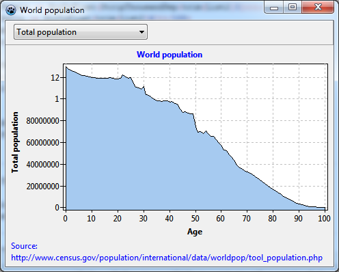
Not too bad, some flaws, though.
- The labels of the y axis are strange. Why do they jump from 80000000 to 1, and then to 12? This seems to be due to a bug of the
Formatfunction in some FPC versions. If you have that issue like me, simply change the propertyLeftAxis.Marks.Format. This string is passed to theFormatfunction to convert numbers to strings. The format specifier "%0.0n" for example avoids that conversion error and, additionally, adds nice thousand separators to the labels which makes them much more readable. - There is a small gap between y axis and the filled area series. Similarly, the filled area reaches below the x axis. This is caused by the
Marginproperty of the chart. This property is usually quite helpful to create an empty area near the plot axes, free from overlapping symbols and marks labels. But here, it is a bit annoying. So just setChart.Margin.LeftandChart.Margin.Bottomto 0. - Ah, and the combobox is not yet working. We need to assign an event handler for OnSelect. What does it have to do? Well, when a new combobox item has been selected the UserDefinedChartSource reports a different y value to the series - that's what we want. But how we get the OnGetChartDataItem being called? Just by redrawing the chart! When the series is redrawn it always has to query the data from the chart source, so it will get the correct data automatically. OK - let's call Chart1.Invalidate:
<source> procedure TForm1.ComboBox1Select(Sender: TObject); begin
Chart1.Invalidate;
end;

