NiceSideBar
The following text is based on the readme.html file which is included in the NiceSideBar installation directory. It is written by the original author of the component, Priyatna. The text was also published on the author's web site which, however, is not available any more.
Introduction
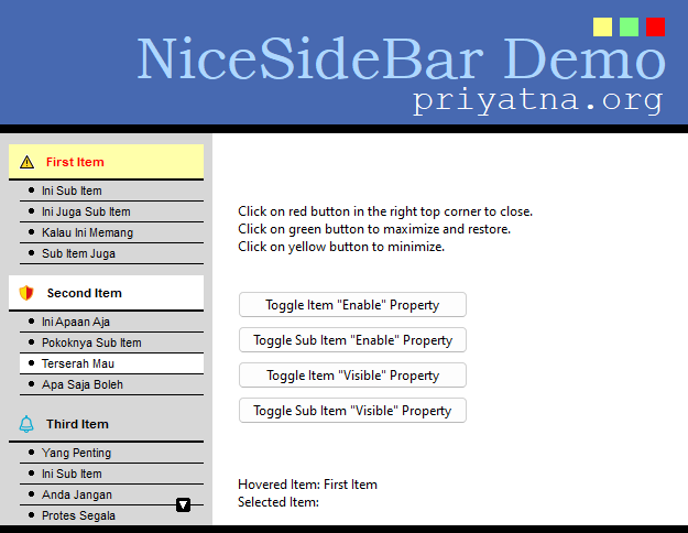
NiceSideBar is a visual component for Delphi and for Lazarus which can be used as a menu. It mimics a side menu usually used in web sites. It has a flat design and is highly customizable. It supports two menu levels (menu and sub menu). Each menu can have a glyph that is supplied by an image list. It has hover state effect too.
Version History
Version 2.0
Released: June 2023
- Lazarus support
- Cross-platform: Win32/64, Linux (gtk2, gtk3, qt, qt5, qt6), macOS (cocoa)
- High-dpi support in the Lazarus version
Version 1.2
Released: January 12, 2008
- Added properties to items and subitems: Enabled, Visible, ItemEnabled, ItemVisible
- Added properties: disabled colors, disabled images
- Keyboard control: PgUp, PgDown, Up and Down arrows
- Reported bugs fixed
Version 1.1
Released: June 28, 2007
- Reported bugs fixed
Version 1.0
Released: May 26th, 2007
- Initial Release
License
This library is released under Mozilla Public License. You can use it in your freeware, shareware or commercial softwares. You can send your modification to me, and if I decide to include it in the main distribution, I will add your name as a contributor. You can read full licensing information in the file License.txt in the NiceSideBar installation folder.
Download and installation
The easiest way for Lazarus users is to get the package from the Online Package Manager (OPM) which is installed with newer Lazarus versions. Simply open its menu item, check "NiceSideBar" in the tree list, and click "Install". Then OPM will take care of the download and the installation.
Since the OPM version may not always be up-to-date, you can also download the development version from the "Lazarus Component and Code Repository" (CCR) where a zipped snapshot is provided (https://sourceforge.net/p/lazarus-ccr/svn/HEAD/tree/components/nicegrid/). Alternatively, if you use SVN you can use the following SVN command in a console window:
svn checkout svn://svn.code.sf.net/p/lazarus-ccr/svn/components/nicesidebar nicesidebar
This applies also for Delphi users.
In Lazarus, open the nicesidebarlaz.lpk file in the package editor ("Package" > "Open Package File (.lpk)"), click "Use" > "Install", and let the IDE recompile itself.
In Delphi, open NiceSideBarD7.dpk in the IDE and press the Install button. Another package is provided in the download for newer Delphi versions, named NiceSideBarXE11; although tested under Delphi XE11 (Alexandria) it should work in other Delphi versions as well.
The component will appear on the priyatna.org component palette tab.
Documentation
Methods
Here are some main methods of the component:
- procedure BeginUpdate;
- Call this method to temporarily prevent the control from updating its content. This is useful when you want to add bulky items to the control.
- procedure EndUpdate;
- This method is used to re-enable update after calling BeginUpdate. You must call BeginUpdate prior to call this method.
Properties
These are some main properties of the component:
- property Items: TSideBarItems;
- A collection of items. Each item usually has sub-items. You can associate item with a menu group. Each item can have a glyph supplied from an image list, while sub-items use bullets.
- property ItemIndex: Integer;
- Specifies which item currently is selected.
- property SubItemIndex: Integer;
- Specifies which sub-item currently is selected.
- property ItemStyle: TSideBarItemStyle;
- This is where you can customize an item: normal state font and color, selected state font and color, hover state font and color, and also line color.
- property SubItemStyle: TSideBarItemStyle;
- This is where you can customize sub-items: normal state font and color, selected state font and color, hover state font and color, and also line color.
- property Bullets: TSideBarBulletStyle;
- This is where you can customize bullets: visibility, normal hover and selected state colors, outline colors and size. Currently it has three bullet style: round, rectangle and diamond.
- property Scrollers: TSideBarScrollerStyle;
- This is where you can customize the scroller arrow: normal, hover and selected colors and outline colors.
- property ItemHeight: Integer;
- Specifies the item height in pixels.
- property SubItemHeight: Integer;
- Specifies the height of sub-items in pixels.
- property Alignment: TSideBarAlign;
- Specifies alignment of the item caption: left, right or centered.
- property Margin: Integer;
- Specifies the margin, in pixels.
- property GroupSeparator: Integer;
- Specifies the vertical margin between groups (items), in pixels.
- property Indent: Integer;
- Specifies the amount of indentation of sub-items, in pixels.
- property AlwaysExpand: Boolean;
- Set to true if you want the control to always expands its sub-items.
- property Images: TImageList;
- Specifies the image list to use for items.
- property HoverImages: TImageList;
- Specifies an image list to use for items when in hover mode.
- property SelectedImages: TImageList;
- Specifies an image list to use for items when in selected mode.
- property HandPointCursor: Boolean;
- Set to true to use a handpoint cursor instead the default one.
- property OnHover: TSideBarEvent;
- An event that is fired everytime the mouse hovers over an item or sub-item.
- property OnSelect: TSideBarEvent;
- An event that is fired everytime the user selects an item or sub-item.
- property OnCustomDrawItem: TSideBarCustomDrawItem;
- You can customize item drawing by handling this event.
- property OnCustomDrawSubItem: TSideBarCustomDrawSubItem;
- You can customize sub-item drawing by handling this event.
- property OnCustomDrawNonItem: TSideBarCustomDrawNonItem;
- You can customize background drawing by handling this event.
- property OnCustomDrawScroller: TSideBarCustomDrawScroller;
- You can customize scroller drawing by handling this event.
Contact
Don't hesitate to report any bug or whish to me:
Priyatna Bandung - Indonesia
