Difference between revisions of "ATButton"
From Free Pascal wiki
Jump to navigationJump to search| (6 intermediate revisions by the same user not shown) | |||
| Line 5: | Line 5: | ||
* button state can be: usual (default: light gray), mouse-over (light gray), checked (dark gray), disabled (red-gray) | * button state can be: usual (default: light gray), mouse-over (light gray), checked (dark gray), disabled (red-gray) | ||
* buttons have border of 1..n pixels | * buttons have border of 1..n pixels | ||
| + | * prop Caption | ||
* prop Checkable means that click toggles Checked | * prop Checkable means that click toggles Checked | ||
* prop Focusable means that button can focus (and paint frame of other color if focused) | * prop Focusable means that button can focus (and paint frame of other color if focused) | ||
| − | |||
* prop Flat: passive (not under cursor) button don't paint its backgnd and border | * prop Flat: passive (not under cursor) button don't paint its backgnd and border | ||
* prop Kind: button can have several kinds. | * prop Kind: button can have several kinds. | ||
| Line 23: | Line 23: | ||
* abuTextIconHorz: Show icon and caption righter it. | * abuTextIconHorz: Show icon and caption righter it. | ||
* abuTextIconVert: Show icon and caption below it. | * abuTextIconVert: Show icon and caption below it. | ||
| − | |||
| − | |||
* abuSeparatorHorz: Show horizontal separator line. | * abuSeparatorHorz: Show horizontal separator line. | ||
* abuSeparatorVert: Show vertical separator line. | * abuSeparatorVert: Show vertical separator line. | ||
| − | |||
| − | Icon can be set by 2 | + | Icon can be set by 2 ways: |
* prop Images: TImageList; with prop ImageIndex (used first) | * prop Images: TImageList; with prop ImageIndex (used first) | ||
* prop Picture: TPicture (used if no Images/ImageIndex is set) | * prop Picture: TPicture (used if no Images/ImageIndex is set) | ||
| + | |||
| + | To paint also drop-down arrow on the right side, set Arrow=True. | ||
| + | To make button with arrow only, set Kind=abuTextOnly and Arrow=True. | ||
= Theme = | = Theme = | ||
| Line 38: | Line 38: | ||
Colors/fonts of all buttons defined by global var, of type like this | Colors/fonts of all buttons defined by global var, of type like this | ||
| − | <syntaxhighlight> | + | <syntaxhighlight lang="pascal"> |
type | type | ||
TATButtonTheme = record | TATButtonTheme = record | ||
| Line 70: | Line 70: | ||
= Download = | = Download = | ||
| − | + | GitHub repository: https://github.com/Alexey-T/ATFlatControls | |
| − | |||
| − | |||
| − | |||
| − | |||
| − | |||
| − | |||
| + | [[Category:Lazarus]] | ||
[[Category:Components]] | [[Category:Components]] | ||
Latest revision as of 14:07, 16 December 2021
About
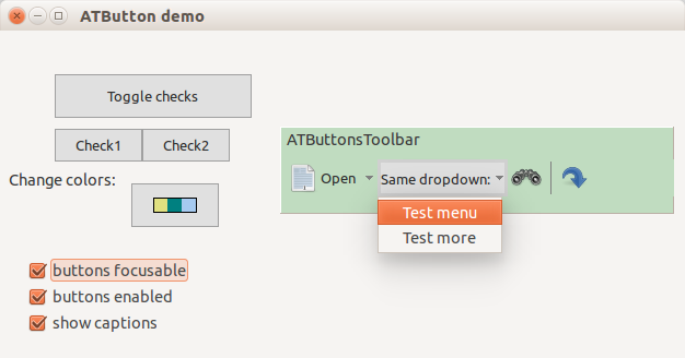
ATButton is OS-independant button component, flat look. Button as usual has Caption, OnClick.
- button state can be: usual (default: light gray), mouse-over (light gray), checked (dark gray), disabled (red-gray)
- buttons have border of 1..n pixels
- prop Caption
- prop Checkable means that click toggles Checked
- prop Focusable means that button can focus (and paint frame of other color if focused)
- prop Flat: passive (not under cursor) button don't paint its backgnd and border
- prop Kind: button can have several kinds.
Author: Alexey Torgashin
Kinds of buttons
Buttons can have these Kind values:
- abuTextOnly: Show caption only.
- abuIconOnly: Show icon only.
- abuTextIconHorz: Show icon and caption righter it.
- abuTextIconVert: Show icon and caption below it.
- abuSeparatorHorz: Show horizontal separator line.
- abuSeparatorVert: Show vertical separator line.
Icon can be set by 2 ways:
- prop Images: TImageList; with prop ImageIndex (used first)
- prop Picture: TPicture (used if no Images/ImageIndex is set)
To paint also drop-down arrow on the right side, set Arrow=True. To make button with arrow only, set Kind=abuTextOnly and Arrow=True.
Theme
Colors/fonts of all buttons defined by global var, of type like this
type
  TATButtonTheme = record
    FontName: string;
    FontSize: integer;
    FontStyles: TFontStyles;
    ColorFont,
    ColorFontDisabled,
    ColorBgPassive,
    ColorBgOver,
    ColorBgChecked,
    ColorBgDisabled,
    ColorArrow,
    ColorBorderPassive,
    ColorBorderOver,
    ColorBorderFocused: TColor;
    MouseoverBorderWidth: integer;
    PressedBorderWidth: integer;
    PressedCaptionShiftY: integer;
    PressedCaptionShiftX: integer;
  end;

var
  ATButtonTheme: TATButtonTheme;
License
MPL 2.0 or LGPL.
Download
GitHub repository: https://github.com/Alexey-T/ATFlatControls
