Difference between revisions of "TAChart Tutorial: Getting started"
m (→Adding data) |
m (Trev moved page TAChart Tutorial: Getting started/ru to TAChart Tutorial: Getting started over a redirect without leaving a redirect: Fix Russian vandalism) |
||
| (14 intermediate revisions by 4 users not shown) | |||
| Line 1: | Line 1: | ||
| + | {{TAChart Tutorial: Getting started}} | ||
| + | |||
== Introduction == | == Introduction == | ||
| Line 13: | Line 15: | ||
== What is needed? == | == What is needed? == | ||
| − | This guide will be very elemental. Of course, you'll need basic knowledge of the Object Pascal language and the Lazarus IDE. | + | This guide will be very elemental. Of course, you'll need basic knowledge of the [[Object Pascal]] language and the Lazarus [[IDE]]. |
TAChart is included in Lazarus, so there is no need for seeking this package somewhere in the internet. However, don't use a too-old version of Lazarus since TAChart is being actively developed and some features may change from version to version. | TAChart is included in Lazarus, so there is no need for seeking this package somewhere in the internet. However, don't use a too-old version of Lazarus since TAChart is being actively developed and some features may change from version to version. | ||
| − | It is best if you follow this tutorial step by step. But if you want you can use the source code of the finished project at the end of this article. | + | It is best if you follow this tutorial step by step. But if you want you can use the [[Source code|source code]] of the finished project at the end of this article. |
== A new project == | == A new project == | ||
[[File:TAChart_component_palette.png]] | [[File:TAChart_component_palette.png]] | ||
| − | To begin with, we create a new project in Lazarus and, in the component palette we select the page "Chart". Click on the left-most icon, the TChart component, and add it to the form. You will see an empty diagram with standardized x and y axes. | + | To begin with, we create a new project in Lazarus and, in the [[Component Palette|component palette]] we select the page [[Chart_tab|"Chart"]]. Click on the left-most icon, the [[TChart]] component, and add it to the form. You will see an empty diagram with standardized x and y axes. |
[[File:TAChart_GettingStarted_Step1.png]] | [[File:TAChart_GettingStarted_Step1.png]] | ||
| Line 31: | Line 33: | ||
[[file:TAChart_GettingStarted_Step1a.png]] | [[file:TAChart_GettingStarted_Step1a.png]] | ||
| − | Before we do that let us have a look at the object inspector tree. TAChart uses a quite complex architecture of classes and containers, so it is important to understand the object tree. In the current state of our project we see the TChart component and its children, the three line series and the AxisList with Left and Bottom axes as children again. The series names are constructed according to < | + | Before we do that let us have a look at the object inspector tree. TAChart uses a quite complex architecture of classes and containers, so it is important to understand the object tree. In the current state of our project we see the TChart component and its children, the three line series and the AxisList with Left and Bottom axes as children again. The series names are constructed according to <syntaxhighlight lang="pascal" inline>Chart<number><SeriesType><Number></syntaxhighlight>. |
[[file:tachart_getting_started_object_tree.png]] | [[file:tachart_getting_started_object_tree.png]] | ||
| − | Why don't we give them more descriptive names, like < | + | Why don't we give them more descriptive names, like <syntaxhighlight lang="pascal" inline>SinSeries</syntaxhighlight>, <syntaxhighlight lang="pascal" inline>CosSeries</syntaxhighlight>, and <syntaxhighlight lang="pascal" inline>SinCosSeries</syntaxhighlight>? For this purpose, click on each series, and change the series <syntaxhighlight lang="pascal" inline>Name</syntaxhighlight> in the corresponding field of the object inspector below. |
== Adding data == | == Adding data == | ||
| − | Now it's time to add data. The easiest option is to create the data along with the form, i.e. we write a handler for the forms's < | + | Now it's time to add data. The easiest option is to create the data along with the form, i.e. we write a handler for the forms's <syntaxhighlight lang="pascal" inline>OnCreate</syntaxhighlight> event. Of course, in a "real" project, you will add data at other occasions, for example after a button click which might initiate a calculation or read data from a file. |
| − | < | + | <syntaxhighlight lang="pascal"> |
procedure TForm1.FormCreate(Sender: TObject); | procedure TForm1.FormCreate(Sender: TObject); | ||
const | const | ||
| Line 57: | Line 59: | ||
end; | end; | ||
end; | end; | ||
| − | </ | + | </syntaxhighlight> |
| − | This procedure creates 100 data points for each series. The x values are calculated to be equidistant between < | + | This [[Procedure|procedure]] creates 100 data points for each series. The x values are calculated to be equidistant between <syntaxhighlight lang="pascal" inline>MIN</syntaxhighlight> and <syntaxhighlight lang="pascal" inline>MAX</syntaxhighlight>, i.e. -10 and 10. The important lines are the calls to the <syntaxhighlight lang="pascal" inline>AddXY</syntaxhighlight> [[Method|method]] of each series. This method takes the x and y coordinates of each data point and adds them to an internal list. There are also overloaded versions of this method where you can also pass a text label for each data point, as well as an individual color, but we don't need this feature here. |
| − | The mentioned list is a so-called chart source - this is a class which provides the data for plotting. You can use the built-in chart source, or you can link the series to a separate one. There is a variety of chart sources in the component palette, like | + | The mentioned list is a so-called chart source - this is a [[Class|class]] which provides the data for plotting. You can use the built-in chart source, or you can link the series to a separate one. There is a variety of chart sources in the component palette, like |
| − | * < | + | * <syntaxhighlight lang="pascal" inline>TListChartSource</syntaxhighlight> which stores the data in a list (this type is used by our series internally) |
| − | * < | + | * <syntaxhighlight lang="pascal" inline>TDBChartSource</syntaxhighlight> which interfaces to the records and fields in a database |
| − | * < | + | * <syntaxhighlight lang="pascal" inline>TUserDefinedChartSource</syntaxhighlight> which gives a very general access to data, for example, stored in an array of user-defined records |
| − | * < | + | * <syntaxhighlight lang="pascal" inline>TCalculatedChartSource</syntaxhighlight> which allows to analyze one series and display the results in another one. |
But enough on chart sources - the built-in source is sufficient for this introductory project. | But enough on chart sources - the built-in source is sufficient for this introductory project. | ||
| Line 75: | Line 77: | ||
== Formatting the series == | == Formatting the series == | ||
| − | Why don't we change the color of each series? To do this select each series in the object tree and, in the object inspector below, change the property < | + | Why don't we change the color of each series? To do this select each series in the object tree and, in the object inspector below, change the [[Property|property]] <syntaxhighlight lang="pascal" inline>SeriesColor</syntaxhighlight> as you want it to be - <syntaxhighlight lang="pascal" inline>SeriesColor</syntaxhighlight> is the color of the lines connecting the data points. |
When you recompile you will see the series colored. But we still cannot distinguish between the different functions. What we need is a legend. | When you recompile you will see the series colored. But we still cannot distinguish between the different functions. What we need is a legend. | ||
== Adding a legend == | == Adding a legend == | ||
| − | Highlight the chart and, in the object inspector, scroll down to < | + | Highlight the chart and, in the object inspector, scroll down to <syntaxhighlight lang="pascal" inline>Legend</syntaxhighlight> and open the sub-properties. At the end, there is <syntaxhighlight lang="pascal" inline>Visible</syntaxhighlight> which is <syntaxhighlight lang="pascal" inline>false</syntaxhighlight> by default - so, set it to <syntaxhighlight lang="pascal" inline>true</syntaxhighlight>, and recompile. |
[[file:tachart_getting_started_step3.png]] | [[file:tachart_getting_started_step3.png]] | ||
| − | Well, it's getting better. What is missing, is an explanatory text for each series, like < | + | Well, it's getting better. What is missing, is an explanatory text for each series, like <syntaxhighlight lang="pascal" inline>y = sin(x)</syntaxhighlight>. For this purpose each series has a property <syntaxhighlight lang="pascal" inline>Title</syntaxhighlight> - this is the text which will appear in the legend for each entry along with the symbol for the corresponding series. Therefore you have to go through all series again and use the object inspector to set <syntaxhighlight lang="pascal" inline>Title</syntaxhighlight> to <syntaxhighlight lang="pascal" inline>y=sin(x)</syntaxhighlight>, <syntaxhighlight lang="pascal" inline>y=cos(x)</syntaxhighlight>, and <syntaxhighlight lang="pascal" inline>y=sin(x)*cos(x)</syntaxhighlight>, respectively. |
[[file:tachart_getting_started_step4.png]] | [[file:tachart_getting_started_step4.png]] | ||
[[file:tachart_getting_started_step4a.png]] | [[file:tachart_getting_started_step4a.png]] | ||
| − | Now when you recompile, the chart is almost perfect. Almost - because the legend is quite large, and the diagram is squeezed into the remaining space. Of course, we could increase the size of the form. But can we also put the legend underneath the diagram? No problem: go back to the chart's property < | + | Now when you recompile, the chart is almost perfect. Almost - because the legend is quite large, and the diagram is squeezed into the remaining space. Of course, we could increase the size of the form. But can we also put the legend underneath the diagram? No problem: go back to the chart's property <syntaxhighlight lang="pascal" inline>Legend</syntaxhighlight> and set <syntaxhighlight lang="pascal" inline>Alignment</syntaxhighlight> to <syntaxhighlight lang="pascal" inline>laBottomCenter</syntaxhighlight>. You should also set <syntaxhighlight lang="pascal" inline>ColumnCount</syntaxhighlight> to <syntaxhighlight lang="pascal" inline>3</syntaxhighlight>, otherwise the legend items will be in a column instead of in a row. |
[[file:tachart_getting_started_step5.png]] | [[file:tachart_getting_started_step5.png]] | ||
| − | Ah! -- the third legend entry is truncated because the window is not wide enough. Align the chart to < | + | Ah! -- the third legend entry is truncated because the window is not wide enough. Align the chart to <syntaxhighlight lang="pascal" inline>alClient</syntaxhighlight> and increase the width of the window a bit. |
== Fine-tuning == | == Fine-tuning == | ||
A few more things can still be improved: The axes should have a title, like "x axis" and "y axis", respectively, and there should also be a title above the chart. | A few more things can still be improved: The axes should have a title, like "x axis" and "y axis", respectively, and there should also be a title above the chart. | ||
| − | To set the title for the x axis select in the object tree the item < | + | To set the title for the x axis select in the object tree the item <syntaxhighlight lang="pascal" inline>Bottom</syntaxhighlight> of the AxisList child component of TChart, or go to <syntaxhighlight lang="pascal" inline>Bottom axis</syntaxhighlight> in the object inspector. Open the sub-properties where you'll find <syntaxhighlight lang="pascal" inline>Title</syntaxhighlight> which has sub-properties again. The text in the field <syntaxhighlight lang="pascal" inline>Caption</syntaxhighlight> will be displayed as a title above the chart. Don't forget to set <syntaxhighlight lang="pascal" inline>Visible</syntaxhighlight> to <syntaxhighlight lang="pascal" inline>true</syntaxhighlight>. You may also want to set the font style of the title to bold - you find that property under <syntaxhighlight lang="pascal" inline>LabelFont</syntaxhighlight>. Repeat the same with <syntaxhighlight lang="pascal" inline>Left axis</syntaxhighlight>. |
| − | Essentially the same procedure can be used to set the chart title: Scroll to the chart's property < | + | Essentially the same procedure can be used to set the chart title: Scroll to the chart's property <syntaxhighlight lang="pascal" inline>Title</syntaxhighlight>, enter the title in the field <syntaxhighlight lang="pascal" inline>Text</syntaxhighlight> (you may even use a multi-line text here), and set <syntaxhighlight lang="pascal" inline>Visible</syntaxhighlight> to <syntaxhighlight lang="pascal" inline>true</syntaxhighlight> again. |
| − | And finally, you might prefer to use a white background of the chart area, this is changed by the property < | + | And finally, you might prefer to use a white background of the chart area, this is changed by the property <syntaxhighlight lang="pascal" inline>BackColor</syntaxhighlight> of TChart. And maybe the grid should be less emphasized, i.e. it might look better with color <syntaxhighlight lang="pascal" inline>clSilver</syntaxhighlight>. Use the left and bottom axes property <syntaxhighlight lang="pascal" inline>Grid.Color</syntaxhighlight> to change that. |
== Finished! == | == Finished! == | ||
| Line 108: | Line 110: | ||
In the end, our chart looks like this. Neat, isn't it? And it was not difficult at all... | In the end, our chart looks like this. Neat, isn't it? And it was not difficult at all... | ||
| − | If you want to learn more about TAChart have a look at the official [[TAChart documentation]], and study some of the many demos that come with TAChart. They can be found in the folder < | + | If you want to learn more about TAChart have a look at the official [[TAChart documentation]], and study some of the many demos that come with TAChart. They can be found in the folder <syntaxhighlight lang="pascal" inline>components\tachart\demo</syntaxhighlight> of your Lazarus installation. |
[[file:tachart_getting_started_step6.png]] | [[file:tachart_getting_started_step6.png]] | ||
| Line 117: | Line 119: | ||
=== Project file === | === Project file === | ||
| − | < | + | <syntaxhighlight lang="pascal"> |
program project1; | program project1; | ||
| Line 138: | Line 140: | ||
Application.Run; | Application.Run; | ||
end. | end. | ||
| − | </ | + | </syntaxhighlight> |
=== Unit1.pas === | === Unit1.pas === | ||
| − | < | + | <syntaxhighlight lang="pascal"> |
unit Unit1; | unit Unit1; | ||
| Line 196: | Line 198: | ||
end. | end. | ||
| − | </ | + | </syntaxhighlight> |
=== Unit.lfm === | === Unit.lfm === | ||
| − | < | + | <syntaxhighlight lang="pascal"> |
object Form1: TForm1 | object Form1: TForm1 | ||
Left = 14 | Left = 14 | ||
| Line 261: | Line 263: | ||
end | end | ||
end | end | ||
| − | </ | + | </syntaxhighlight> |
| − | |||
| − | |||
| − | |||
Latest revision as of 00:48, 13 April 2023
│
Deutsch (de) │
English (en) │
suomi (fi) │
français (fr) │
日本語 (ja) │
русский (ru) │
Introduction
If you want to add a plot or a chart to your Lazarus form you should have a look at TAChart. This is the standard Lazarus package for drawing plots and charts.
In this tutorial we will draw some elemental mathematical functions by TAChart. We will create a chart with three line series for the functions
- y=cos(x),
- y=sin(x), and
- y=cos(x)*sin(x).
Maybe it is necessary to expain the words "series" and "chart" here: the entire diagram is the "chart", and each of the functions will be displayed as a curve called "series". We will connect the data points by line sections, therefore, we will use the "line series". TAChart, of course, allows to use many other types of series, for example bar series, area series, pie series, or even advanced types like spline or fit series.
What is needed?
This guide will be very elemental. Of course, you'll need basic knowledge of the Object Pascal language and the Lazarus IDE.
TAChart is included in Lazarus, so there is no need for seeking this package somewhere in the internet. However, don't use a too-old version of Lazarus since TAChart is being actively developed and some features may change from version to version.
It is best if you follow this tutorial step by step. But if you want you can use the source code of the finished project at the end of this article.
A new project
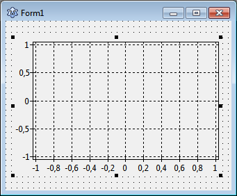
To begin with, we create a new project in Lazarus and, in the component palette we select the page "Chart". Click on the left-most icon, the TChart component, and add it to the form. You will see an empty diagram with standardized x and y axes.
Adding series
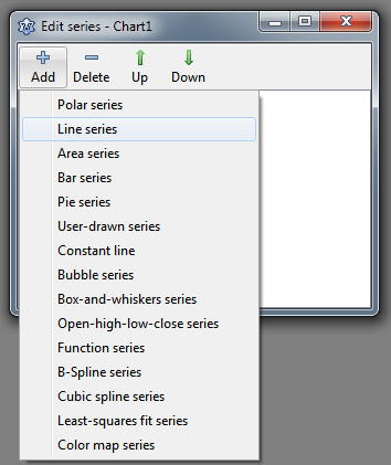
Now let's add series. For this purpose, double-click on the chart (or right-click, and select "Edit series" from the context menu). The TAChart series editor appears. It is still empty, but when you select "Add" you will see a menu with all the series types available within the TAChart package. Select the "line series". Repeat two times to create, in total, three line series that are assigned to the chart. They are not yet displayed in the chart, because they do not yet have any data. No data - no display. We will fix that in a minute.
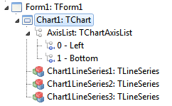
Before we do that let us have a look at the object inspector tree. TAChart uses a quite complex architecture of classes and containers, so it is important to understand the object tree. In the current state of our project we see the TChart component and its children, the three line series and the AxisList with Left and Bottom axes as children again. The series names are constructed according to Chart<number><SeriesType><Number>.
Why don't we give them more descriptive names, like SinSeries, CosSeries, and SinCosSeries? For this purpose, click on each series, and change the series Name in the corresponding field of the object inspector below.
Adding data
Now it's time to add data. The easiest option is to create the data along with the form, i.e. we write a handler for the forms's OnCreate event. Of course, in a "real" project, you will add data at other occasions, for example after a button click which might initiate a calculation or read data from a file.
procedure TForm1.FormCreate(Sender: TObject);
const
  N = 100;
  MIN = -10;
  MAX = 10;
var
  i: Integer;
  x: Double;
begin
  for i:=0 to N-1 do begin
    x := MIN + (MAX - MIN) * i /(N - 1);
    SinSeries.AddXY(x, sin(x));
    CosSeries.AddXY(x, cos(x));
    SinCosSeries.AddXY(x, sin(x)*cos(x));
  end;
end;
This procedure creates 100 data points for each series. The x values are calculated to be equidistant between MIN and MAX, i.e. -10 and 10. The important lines are the calls to the AddXY method of each series. This method takes the x and y coordinates of each data point and adds them to an internal list. There are also overloaded versions of this method where you can also pass a text label for each data point, as well as an individual color, but we don't need this feature here.
The mentioned list is a so-called chart source - this is a class which provides the data for plotting. You can use the built-in chart source, or you can link the series to a separate one. There is a variety of chart sources in the component palette, like
TListChartSourcewhich stores the data in a list (this type is used by our series internally)TDBChartSourcewhich interfaces to the records and fields in a databaseTUserDefinedChartSourcewhich gives a very general access to data, for example, stored in an array of user-defined recordsTCalculatedChartSourcewhich allows to analyze one series and display the results in another one.
But enough on chart sources - the built-in source is sufficient for this introductory project.
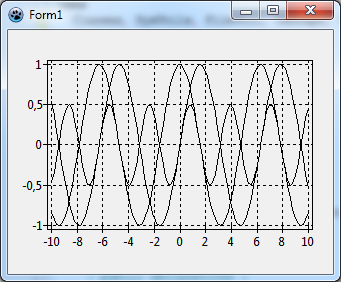
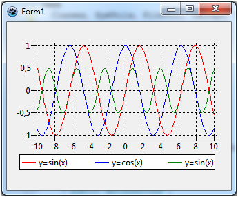
Ok, let's compile the program. We see the three curves, and the x axis automatically covers our data range between -10 and 10. Well - not too bad, but far from being perfect: The diagram is very confusing, we cannot distinguish between the individual lines, and we cannot tell which series belongs to which function.
Formatting the series
Why don't we change the color of each series? To do this select each series in the object tree and, in the object inspector below, change the property SeriesColor as you want it to be - SeriesColor is the color of the lines connecting the data points.
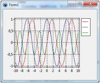
When you recompile you will see the series colored. But we still cannot distinguish between the different functions. What we need is a legend.
Adding a legend
Highlight the chart and, in the object inspector, scroll down to Legend and open the sub-properties. At the end, there is Visible which is false by default - so, set it to true, and recompile.
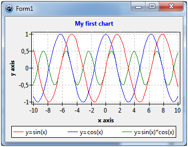
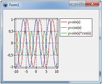
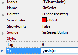
Well, it's getting better. What is missing, is an explanatory text for each series, like y = sin(x). For this purpose each series has a property Title - this is the text which will appear in the legend for each entry along with the symbol for the corresponding series. Therefore you have to go through all series again and use the object inspector to set Title to y=sin(x), y=cos(x), and y=sin(x)*cos(x), respectively.
Now when you recompile, the chart is almost perfect. Almost - because the legend is quite large, and the diagram is squeezed into the remaining space. Of course, we could increase the size of the form. But can we also put the legend underneath the diagram? No problem: go back to the chart's property Legend and set Alignment to laBottomCenter. You should also set ColumnCount to 3, otherwise the legend items will be in a column instead of in a row.
Ah! -- the third legend entry is truncated because the window is not wide enough. Align the chart to alClient and increase the width of the window a bit.
Fine-tuning
A few more things can still be improved: The axes should have a title, like "x axis" and "y axis", respectively, and there should also be a title above the chart.
To set the title for the x axis select in the object tree the item Bottom of the AxisList child component of TChart, or go to Bottom axis in the object inspector. Open the sub-properties where you'll find Title which has sub-properties again. The text in the field Caption will be displayed as a title above the chart. Don't forget to set Visible to true. You may also want to set the font style of the title to bold - you find that property under LabelFont. Repeat the same with Left axis.
Essentially the same procedure can be used to set the chart title: Scroll to the chart's property Title, enter the title in the field Text (you may even use a multi-line text here), and set Visible to true again.
And finally, you might prefer to use a white background of the chart area, this is changed by the property BackColor of TChart. And maybe the grid should be less emphasized, i.e. it might look better with color clSilver. Use the left and bottom axes property Grid.Color to change that.
Finished!
In the end, our chart looks like this. Neat, isn't it? And it was not difficult at all...
If you want to learn more about TAChart have a look at the official TAChart documentation, and study some of the many demos that come with TAChart. They can be found in the folder components\tachart\demo of your Lazarus installation.
Source code
The source code of this tutorial project can be found in the folder tutorials/getting_started of trunk TAChart installations.
Project file
program project1;

{$mode objfpc}{$H+}

uses
  {$IFDEF UNIX}{$IFDEF UseCThreads}
  cthreads,
  {$ENDIF}{$ENDIF}
  Interfaces, // this includes the LCL widgetset
  Forms, Unit1, tachartlazaruspkg
  { you can add units after this };

{$R *.res}

begin
  RequireDerivedFormResource := True;
  Application.Initialize;
  Application.CreateForm(TForm1, Form1);
  Application.Run;
end.
Unit1.pas
unit Unit1;

{$mode objfpc}{$H+}

interface

uses
  Classes, SysUtils, FileUtil, TAGraph, TASeries, Forms, Controls, Graphics,
  Dialogs;

type

  { TForm1 }

  TForm1 = class(TForm)
    Chart1: TChart;
    SinSeries: TLineSeries;
    CosSeries: TLineSeries;
    SinCosSeries: TLineSeries;
    procedure FormCreate(Sender: TObject);
  private
    { private declarations }
  public
    { public declarations }
  end;

var
  Form1: TForm1;

implementation

{$R *.lfm}

{ TForm1 }

procedure TForm1.FormCreate(Sender: TObject);
const
  N = 100;
  MIN = -10;
  MAX = 10;
var
  i: Integer;
  x: Double;
begin
  for i:=0 to N - 1 do begin
    x := MIN + (MAX - MIN) * i / (N - 1);
    SinSeries.AddXY(x, sin(x));
    CosSeries.AddXY(x, cos(x));
    SinCosSeries.AddXY(x, sin(x)*cos(x));
  end;

end;

end.
Unit.lfm
object Form1: TForm1
  Left = 14
  Height = 244
  Top = 137
  Width = 347
  Caption = 'Form1'
  ClientHeight = 244
  ClientWidth = 347
  OnCreate = FormCreate
  LCLVersion = '1.1'
  object Chart1: TChart
    Left = 0
    Height = 244
    Top = 0
    Width = 347
    AxisList = <
      item
        Grid.Color = clSilver
        Minors = <>
        Title.LabelFont.Orientation = 900
        Title.LabelFont.Style = [fsBold]
        Title.Visible = True
        Title.Caption = 'y axis'
      end
      item
        Grid.Color = clSilver
        Alignment = calBottom
        Minors = <>
        Title.LabelFont.Style = [fsBold]
        Title.Visible = True
        Title.Caption = 'x axis'
      end>
    BackColor = clWhite
    Foot.Brush.Color = clBtnFace
    Foot.Font.Color = clBlue
    Legend.Alignment = laBottomCenter
    Legend.ColumnCount = 3
    Legend.Visible = True
    Title.Brush.Color = clBtnFace
    Title.Font.Color = clBlue
    Title.Font.Style = [fsBold]
    Title.Text.Strings = (
      'My first chart'
    )
    Title.Visible = True
    Align = alClient
    ParentColor = False
    object SinSeries: TLineSeries
      Title = 'y=sin(x)'
      LinePen.Color = clRed
    end
    object CosSeries: TLineSeries
      Title = 'y=cos(x)'
      LinePen.Color = clBlue
    end
    object SinCosSeries: TLineSeries
      Title = 'y=sin(x)*cos(x)'
      LinePen.Color = clGreen
    end
  end
end
