Difference between revisions of "TRadioButton"
(Added "Usage", "A simple Example", "Usage of a event") |
m (Fixed syntax highlighting) |
||
| (7 intermediate revisions by 2 users not shown) | |||
| Line 1: | Line 1: | ||
{{TRadioButton}} | {{TRadioButton}} | ||
| − | + | A '''TRadioButton''' [[image:tradiobutton.png]] is a component that displays a selection button that works with other Radio Buttons in a mutually exclusive way - if one button is selected, none of the others in the group can be selected. TRadioButtons are selectable from the [[Standard tab]] of the [[Component Palette]]. | |
| − | + | To use a TRadioButton on a [[TForm|Form]], you can simply select it on the component palette ''Standard'' and place it, with one click on the form.<br> | |
| + | It usually does not make sense to use a single radiobutton, because radiobuttons are intended to select anything. Thus, you can instead of individual radiobuttons also a [[TRadioGroup]] use. | ||
| − | |||
| − | |||
| − | |||
| − | |||
| − | |||
| − | |||
| − | |||
| − | |||
| − | |||
| − | |||
Anywhere in your source code, you can get the status of the radiobuttons, whether active or inactive, by query '''<code>Status := <RadioButton>.Checked;</code>'''. You can use ''Checked'' as a normal [[Boolean]]. Thus, the allocation '''<code><RadioButton>.Checked := True;</code>''' is possible. | Anywhere in your source code, you can get the status of the radiobuttons, whether active or inactive, by query '''<code>Status := <RadioButton>.Checked;</code>'''. You can use ''Checked'' as a normal [[Boolean]]. Thus, the allocation '''<code><RadioButton>.Checked := True;</code>''' is possible. | ||
| − | ===A simple | + | ===A simple example=== |
* Create a new application and drop three TRadioButtons on the form. | * Create a new application and drop three TRadioButtons on the form. | ||
| Line 25: | Line 16: | ||
* Create the ''OnClick'' event handler for the TButton, by using the Object Inspector tab events, select the ''OnClick'' event and click the button [...] or double click the button in the form. | * Create the ''OnClick'' event handler for the TButton, by using the Object Inspector tab events, select the ''OnClick'' event and click the button [...] or double click the button in the form. | ||
* Add following code: | * Add following code: | ||
| − | <syntaxhighlight> | + | |
| + | <syntaxhighlight lang=pascal> | ||
procedure TForm1.btnPaintClick(Sender: TObject); | procedure TForm1.btnPaintClick(Sender: TObject); | ||
begin | begin | ||
| Line 39: | Line 31: | ||
===Usage of a event=== | ===Usage of a event=== | ||
| − | The difference to the previous example is, we repaint the form not by a button click, but already by clicking one of the radio buttons themselves. | + | The difference to the previous example is, we repaint the form not by a button click, but already by clicking one of the radio buttons themselves. |
You can modify the previous example, by deleting the button and its ''OnClick'' event handler in the source code. You can create a new example but also easy: | You can modify the previous example, by deleting the button and its ''OnClick'' event handler in the source code. You can create a new example but also easy: | ||
| Line 47: | Line 39: | ||
* Now you can create the ''OnChange'' event handlers for the radiobuttons. For every radiobutton, you can use the Object Inspector tab events, select the ''Onchange'' event and click the button [...], but you can also doubleclick on it. | * Now you can create the ''OnChange'' event handlers for the radiobuttons. For every radiobutton, you can use the Object Inspector tab events, select the ''Onchange'' event and click the button [...], but you can also doubleclick on it. | ||
* Let the event handler ''OnChange'' of the radio buttons change the colors of the form, according to clicked radio button: | * Let the event handler ''OnChange'' of the radio buttons change the colors of the form, according to clicked radio button: | ||
| − | <syntaxhighlight> | + | |
| + | <syntaxhighlight lang=pascal> | ||
procedure TForm1.rbRedChange(Sender: TObject); | procedure TForm1.rbRedChange(Sender: TObject); | ||
begin | begin | ||
| Line 64: | Line 57: | ||
end; | end; | ||
</syntaxhighlight> | </syntaxhighlight> | ||
| + | |||
* Open your application, it should look something like: | * Open your application, it should look something like: | ||
| Line 70: | Line 64: | ||
===Grouping=== | ===Grouping=== | ||
| − | + | If you add a radiobutton to your form is its [[Parent|parent]] (control, which includes the radio button) your form. By each setting (no matter whether via code or user button click) of a '''<code><RadioButton>.Checked:=True;</code>''' is checked whether a different radiobutton, with this parent, is selected and if yes, the property ''Checked'' of this would be changed to ''False''.<br> | |
| + | If you want to use multiple radiobuttons on your form, that are designed to provide different, independent choices, you must group the radio buttons. There are a finished component [[TRadioGroup]] or you group on a control (e.g. [[TPanel]], [[TGroupBox]], [[TNotebook]], [[TPageControl]] etc.).<br> | ||
| − | + | The following example shows how you can group radio buttons: | |
| − | |||
| − | + | You can change the example [[TRadioButton#A simple example|A simple example]] or create a new application: | |
| + | * As first you would need to place a [[TGroupBox]] of the standard component palette onto your form. | ||
| + | * You change its name to ''gbColor'' and its caption to ''Color''. | ||
| + | * Now you subclass this GroupBox that radio buttons ''rbRed'', ''rbGreen'' and ''rbBlue'': | ||
| + | ** In the modified project, you can sequentially move the radiobuttons '''in the Object Inspector''' by drag and drop to ''gbColor''. | ||
| + | ** In a new project, you can insert the three radiobuttons one after the other, by clicking to insert in the GroupBox, then change the names to ''rbRed'', ''rbGreen'' and ''rbBlue'' and the captions to ''Red'', ''Green'' and ''Blue''. | ||
| + | * Now place a second TGroupBox on your form named ''gbBrightness'' with the caption ''Brightness''. | ||
| + | * Add this GroupBox also three radio buttons and give it the name ''rbBrightDark'', ''rbBrightMedDark'' and ''rbBrightBright'' and the captions ''Dark'', ''MediumDark'' and ''Bright''. | ||
| + | * If you have created a new application, you must add a button with name ''btnPaint'' and caption ''Draw new'' to the form. | ||
| + | * In the ''OnClick'' event handler of ''btnPaint'' change the code to: | ||
| − | + | <syntaxhighlight lang=pascal> | |
| − | |||
| − | |||
| − | |||
| − | |||
| − | |||
| − | |||
| − | |||
| − | |||
| − | |||
| − | <syntaxhighlight> | ||
procedure TForm1.btnPaintClick(Sender: TObject); | procedure TForm1.btnPaintClick(Sender: TObject); | ||
begin | begin | ||
| Line 95: | Line 88: | ||
end; | end; | ||
</syntaxhighlight> | </syntaxhighlight> | ||
| − | * | + | |
| − | <syntaxhighlight> | + | * Now create even the function Brightness, by enter the ''private'' section of TForm1, write '''<code>function Brightness: TColor;</code>''' and press the keys [CTRL] + [Shift] + [c] (code completion). The function is created. Enter there following code: |
| + | |||
| + | <syntaxhighlight lang=pascal> | ||
function TForm1.Brightness: TColor; | function TForm1.Brightness: TColor; | ||
begin | begin | ||
| Line 104: | Line 99: | ||
end; | end; | ||
</syntaxhighlight> | </syntaxhighlight> | ||
| − | * | + | |
| + | * Start your application, you can use the grouped radio buttons separate, so it could look like: | ||
[[image:RadioButtonExample5.png]] -> [[image:RadioButtonExample6.png]] | [[image:RadioButtonExample5.png]] -> [[image:RadioButtonExample6.png]] | ||
| − | == | + | ==See also== |
| − | |||
| − | |||
| − | |||
| − | |||
| + | * [[doc:lcl/stdctrls/tradiobutton.html|TRadioButton doc]] | ||
| + | * [[TRadioGroup]] - Usage of RadioGroups<br> | ||
| + | * [[TToggleBox]] - Usage of Toggleboxes<br> | ||
| + | * [[TCheckBox]] - Usage of CheckBoxes<br> | ||
| − | |||
{{LCL Components}} | {{LCL Components}} | ||
| − | |||
| − | |||
| − | |||
| − | |||
| − | |||
Latest revision as of 12:18, 1 March 2020
│
Deutsch (de) │
English (en) │
suomi (fi) │
français (fr) │
日本語 (ja) │
A TRadioButton ![]() is a component that displays a selection button that works with other Radio Buttons in a mutually exclusive way - if one button is selected, none of the others in the group can be selected. TRadioButtons are selectable from the Standard tab of the Component Palette.
is a component that displays a selection button that works with other Radio Buttons in a mutually exclusive way - if one button is selected, none of the others in the group can be selected. TRadioButtons are selectable from the Standard tab of the Component Palette.
To use a TRadioButton on a Form, you can simply select it on the component palette Standard and place it, with one click on the form.
It usually does not make sense to use a single radiobutton, because radiobuttons are intended to select anything. Thus, you can instead of individual radiobuttons also a TRadioGroup use.
Anywhere in your source code, you can get the status of the radiobuttons, whether active or inactive, by query Status := <RadioButton>.Checked;. You can use Checked as a normal Boolean. Thus, the allocation <RadioButton>.Checked := True; is possible.
A simple example
- Create a new application and drop three TRadioButtons on the form.
- In the Object Inspector tab properties change the name the RadioButton1...3 to rbRed, rbGreen and rbBlue.
- Similarly, you change the captions of the radiobuttons to Red, Green and Blue there.
- Add your form a TButton and change its caption to Draw new and its name to btnPaint.
- Create the OnClick event handler for the TButton, by using the Object Inspector tab events, select the OnClick event and click the button [...] or double click the button in the form.
- Add following code:
procedure TForm1.btnPaintClick(Sender: TObject);
begin
  if rbRed.Checked   then Color:=clRed;
  if rbGreen.Checked then Color:=clLime;
  if rbBlue.Checked  then Color:=clBlue;
end;
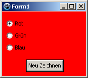
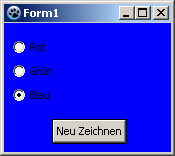
- Open your application, it should look something like:
Usage of a event
The difference to the previous example is, we repaint the form not by a button click, but already by clicking one of the radio buttons themselves.
You can modify the previous example, by deleting the button and its OnClick event handler in the source code. You can create a new example but also easy:
- Create a new application and drop three TRadioButtons on the form.
- In the Object Inspector tab properties change the name the RadioButton1...3 to rbRed, rbGreen and rbBlue.
- Similarly, you change the captions of the radiobuttons to Red, Green and Blue there.
- Now you can create the OnChange event handlers for the radiobuttons. For every radiobutton, you can use the Object Inspector tab events, select the Onchange event and click the button [...], but you can also doubleclick on it.
- Let the event handler OnChange of the radio buttons change the colors of the form, according to clicked radio button:
procedure TForm1.rbRedChange(Sender: TObject);
begin
  Self.Color:=clRed;    //with "Self", you select the object in which the method exists (method: rbRedChange / object: Form1)
end;

procedure TForm1.rbGreenChange(Sender: TObject);
begin
  Form1.Color:=clLime;  //You can directly select the object ''Form1'', but poor,
                        //because then no other object of class 'TForm1' can be created
end;

procedure TForm1.rbBlueChange(Sender: TObject);
begin
  Color:=clBlue;        //or you leave out "Self" and the compiler will automatically detect its own object
end;
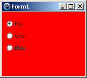
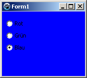
- Open your application, it should look something like:
Grouping
If you add a radiobutton to your form is its parent (control, which includes the radio button) your form. By each setting (no matter whether via code or user button click) of a <RadioButton>.Checked:=True; is checked whether a different radiobutton, with this parent, is selected and if yes, the property Checked of this would be changed to False.
If you want to use multiple radiobuttons on your form, that are designed to provide different, independent choices, you must group the radio buttons. There are a finished component TRadioGroup or you group on a control (e.g. TPanel, TGroupBox, TNotebook, TPageControl etc.).
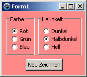
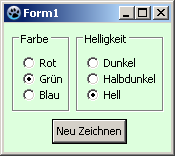
The following example shows how you can group radio buttons:
You can change the example A simple example or create a new application:
- As first you would need to place a TGroupBox of the standard component palette onto your form.
- You change its name to gbColor and its caption to Color.
- Now you subclass this GroupBox that radio buttons rbRed, rbGreen and rbBlue:
- In the modified project, you can sequentially move the radiobuttons in the Object Inspector by drag and drop to gbColor.
- In a new project, you can insert the three radiobuttons one after the other, by clicking to insert in the GroupBox, then change the names to rbRed, rbGreen and rbBlue and the captions to Red, Green and Blue.
- Now place a second TGroupBox on your form named gbBrightness with the caption Brightness.
- Add this GroupBox also three radio buttons and give it the name rbBrightDark, rbBrightMedDark and rbBrightBright and the captions Dark, MediumDark and Bright.
- If you have created a new application, you must add a button with name btnPaint and caption Draw new to the form.
- In the OnClick event handler of btnPaint change the code to:
procedure TForm1.btnPaintClick(Sender: TObject);
begin
  if rbRed.Checked   then Color:=Brightness or clRed;
  if rbGreen.Checked then Color:=Brightness or clLime;
  if rbBlue.Checked  then Color:=Brightness or clBlue;
end;
- Now create even the function Brightness, by enter the private section of TForm1, write
function Brightness: TColor;and press the keys [CTRL] + [Shift] + [c] (code completion). The function is created. Enter there following code:
function TForm1.Brightness: TColor;
begin
  Result:=0;
  if rbBrightMedDark.Checked then Result:=$888888;
  if rbBrightBright.Checked  then Result:=$DDDDDD;
end;
- Start your application, you can use the grouped radio buttons separate, so it could look like:
See also
- TRadioButton doc
- TRadioGroup - Usage of RadioGroups
- TToggleBox - Usage of Toggleboxes
- TCheckBox - Usage of CheckBoxes
