TComboBox/ja
│
Deutsch (de) │
English (en) │
español (es) │
suomi (fi) │
français (fr) │
日本語 (ja) │
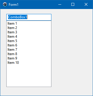
A TComboBox  is a combination of an edit box and a (drop-down) list allowing one of several options to be chosen.
使い方
TComboBoxは、エディットボックスと(ドロップダウン)リストの組み合わせで、いくつかのオプションの中から一つを選択できるようにするものである。
フォーム上でTComboBoxを使用するには、Component Palette/jaのStandard tab/jaタブからそれを選択し、フォーム上でクリックして配置するだけである。
ComboBox内に保存された文字列は、TStrings型のプロパティItemsに保存される。そのため、TStringListやその親クラスであるTStringsで行うように、ComboBox内の文字列を割り当てたり削除したりすることができる。
フォームForm1上のcombobox ComboBox1を使用するいくつかの例を紹介する:
コンボボックスを埋める
オブジェクトインスペクタによって
- フォーム上のComboBoxをクリックで選択する。
- オブジェクトインスペクタでプロパティタブに移動し、プロパティItemsを選択する。
- 3つのドットがあるボタンをクリックする。すると、文字列エディタが開く。
- テキストを入力し、OKで作業を確定する。
フォームを作るときにコードから
- フォームのOnCreateイベントハンドラを作成するには、まずフォームをクリックし、オブジェクトインスペクタでイベントタブを選択する。OnCreateイベントを見つけ、[...]ボタンをクリックするか、フォーム内のどこかをダブルクリックする。
- ソースエディタに移動したら、望む選択テキストを挿入することになる。例えば、以下のように記述することになる:
procedure TForm1.FormCreate(Sender: TObject);
begin
  ComboBox1.Items.Clear;             //存在しているすべての選択を解除
  ComboBox1.Items.Add('Red');        //選択を加える
  ComboBox1.Items.Add('Green');
  ComboBox1.Items.Add('Blue');
  ComboBox1.Items.Add('Random Color');
end;
選択したときに何かを起こさせる
すべてのコンポーネントと同様に、TComboBoxもさまざまなイベントを提供しており、これらはユーザーがコンボボックスを使用したときに呼び出される。ComboBoxでの選択の変更に応答するには、OnChangeイベントを使用できる:
- フォーム上のComboBoxをダブルクリックするか、オブジェクトインスペクタでOnChangeイベントを選択し、[...]ボタンをクリックする。
- イベントハンドラが作成される。ここで、必要なソースコードを挿入できる。私たちの例では、フォームの背景色を変更したいと考えている:
procedure TForm1.ComboBox1Change(Sender: TObject);
begin
  case ComboBox1.ItemIndex of  //どれが(どのアイテムが)現在選択されているか
    0: Color:=clRed;
    1: Color:=clGreen;
    2: Color:=clBlue;
    3: Color:=Random($1000000);
  end;
end;
- アプリケーションを起動すると、によりフォームの背景色が変更される。
イベント
OnGetItemsイベントは、ウィジェットセットのアイテムリストを作成できる場合に呼び出される。そのため、コンボボックスのボタンが押されたときにトリガーされる。
所有者によって描かれたコンボボックス
一般的には、ユーザーが設定で選択したテーマをComboBoxに表示させる方が有利だ。しかし、場合によっては(例えば、カラフルな表面のゲームをプログラムする場合など)、この標準から逸脱し、独自の選択に基づいて描画することもできる。その方法は次の通りである:
 Note: ComboBoxDrawItemのパラメータ :
Control:
もし複数のコントロール(例えば、複数のコンボボックス)がこのイベントハンドルにアクセスするなら、どのコントロールがイベントを引き起こしているか知ることになる。この例ではComboBox1.Canvas.FillRect(ARect)の代わりに、と書けるTComboBox(Control).Canvas.FillRect(ARect)。しかし、それがTComboBoxか否か、事前に確認すべきである:
  if Control is TComboBox then
    TComboBox(Control).Canvas.FillRect(ARect);
Index:
アイテムの場所を特定する。そこで文字列、<ComboBox>.Items[Index].にアクセスできる
ARect:
四角形を述べる。それは背景を描くときに必要である。
State:
アイテムの状態、通常、フォーカスされている、選択されているなど
塗りつぶされた四角形を描く
- フォームを作成する際に、フォームを作るときにコードからの例をを変更することができる。
- オブジェクトインスペクタで、ComboBox1のプロパティStyleをcsOwnerDrawFixedに変更する。
- オブジェクトインスペクタで、イベントOnDrawItemのイベントハンドラを作成するために、[...]ボタンをクリックする。
- 次のコードをハンドラに追加する:
procedure TForm1.ComboBox1DrawItem(Control: TWinControl; Index: Integer;
  ARect: TRect; State: TOwnerDrawState);
var
  ltRect: TRect;

  procedure FillColorfulRect(aCanvas: TCanvas; myRect: TRect);              //任意の色で塗る
  // Fills the rectangle with random colours
  var
    y: Integer;
  begin
    for y:=myRect.Top to myRect.Bottom - 1 do begin
      aCanvas.Pen.Color:=Random($1000000);
      aCanvas.Line(myRect.Left, y, myRect.Right, y);
    end;
  end;

begin
  ComboBox1.Canvas.FillRect(ARect);                                         //最初の通常の背景
  ComboBox1.Canvas.TextRect(ARect, 22, ARect.Top, ComboBox1.Items[Index]);  //アイテムテキストを塗る

  ltRect.Left   := ARect.Left   + 2;                                        //四角形のための色
  ltRect.Right  := ARect.Left   + 20;
  ltRect.Top    := ARect.Top    + 1;
  ltRect.Bottom := ARect.Bottom - 1;

  ComboBox1.Canvas.Pen.Color:=clBlack;
  ComboBox1.Canvas.Rectangle(ltRect);                                       //縁を描く

  if InflateRect(ltRect, -1, -1) then                                       //1ピクセル四角形の大きさを変更する
    if Index = 3 then
      FillColorfulRect(ComboBox1.Canvas, ltRect)                            //任意の色を塗る
    else begin
      case Index of
        0: ComboBox1.Canvas.Brush.Color := clRed;
        1: ComboBox1.Canvas.Brush.Color := clGreen;
        2: ComboBox1.Canvas.Brush.Color := clBlue;
      end;
      ComboBox1.Canvas.FillRect(ltRect);                                    //選択に応じて色を塗る
    end;
end;
- このように見えるだろう:
 ->
-> 
前に画像を置く
この例では、TImageListにいくつかの画像を読み込み、それらをコンボボックスのアイテムの前に描画する。これは、一般的にできることを示すシンプルな例だ。この例では、対応する画像が存在するかどうかなどの詳細を明示的に実行しない。必要に応じてそれらは行われるべきである。
- フォームを作成する際に、コードで例と同様のアプリケーションを作成します。
- オブジェクトインスペクタで、ComboBox1のプロパティStyleをcsOwnerDrawFixedに変更する。
- コンポーネントパレットのCommon controlsからTImageListを追加する。
- ImageList1の高さと幅は16ピクセルに設定されている。これを許可する。画像をコンボボックスにきれいに収めるために、ComboBox1のプロパティItemHeightをオブジェクトインスペクタで18に設定する。
- ImageListに4つの画像を追加する:
- ImageList1をダブルクリックするか、ImageList1を左クリックしてImageList Editorを選択する。
- [Add]をクリックして画像を選択します(<Lazarusディレクトリ>/images/...にはさまざまな16x16pxサイズの画像やアイコンがある)。
- 4つの画像を追加したら、[OK]で作業を確定する。
- オブジェクトインスペクタで、イベントOnDrawItemのイベントハンドラを作成します。[...]ボタンをクリックする。
- 次のコードをハンドラに追加する:
procedure TForm1.ComboBox1DrawItem(Control: TWinControl; Index: Integer;
  ARect: TRect; State: TOwnerDrawState);
begin
  ComboBox1.Canvas.FillRect(ARect);                                         //はじめ通常の背景で塗る
  ComboBox1.Canvas.TextRect(ARect, 20, ARect.Top, ComboBox1.Items[Index]);  //アイテムテキストを塗る
  ImageList1.Draw(ComboBox1.Canvas, ARect.Left + 1, ARect.Top + 1, Index);  //キャンバスのインデクスに従って画像を描く
end;
- このように見えるだろう:
-> 
スタイル
csSimple
csSimple represents itself a simple edit box with a list box underneath. The list box is only shown, if there's enough height allocated. By default the height is set to shown the edit box only.
There's no dropdown icon to show the list box. Items can be changed by using keyboard (arrow keys), or by clicking an an item, if the control is high enough to show the items list.
csSimple style is Windows specific. Non-widows widgetset most likely don't implement and fall back to csDropDown.
Here's an example of (non-autosized) csSimple ComboBox on two different widgetset. (as of Lazarus 2.0.8):
Win32
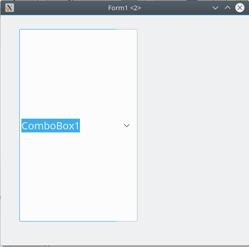
Gtk2


提案されている特徴
読み取り専用
ReadOnly property has been deprecated since 2017. It has been removed as of today.
However, it's possible to reinstate ReadOnly property as a mirror of TEdit readonly.
The complexity of ComboBox is that it bears features of both ListBox and Edit (but it's not a descendant of either). While ComboBox does provides the means to change the selection (just like TEdit), it might be helpful also to make the edit box readonly. (Note, that this is different to csDropDownList. ccDropDownList typically implements a dropdown as a button).
How, ReadOnly property is expected to work:
- it's available for any ComboBox style
- it's does not influence or is not influenced by any ComboBox style selected or changed (unlike the previous implementation of ReadOnly)
- if set to true, the edit box (if supported by the comboBox style on the widgetset) becomes ReadOnly (in terms of TEdit). The content cannot be changed by any text input actions (such as editing, pasting, or dragging the text around).
- the combobox value CAN be changed by selecting a different item from the dropdown, by either using a mouse (or respective key combinations, i.e. up or down arrows)
テキストヒント
As ComboBox bears traits of TEdit, it's should be possible to set TextHint for comboBox, if the value is empty.
Introduce TextHint property that should act similar to TEdit
- if text value of combobox is empty, the TextHint should be presented (in the colors and font style, that's applicable to the current widgetset theme)
以下も参照のこと